

Stories Worth Telling: Five Tableware Collections on Sale
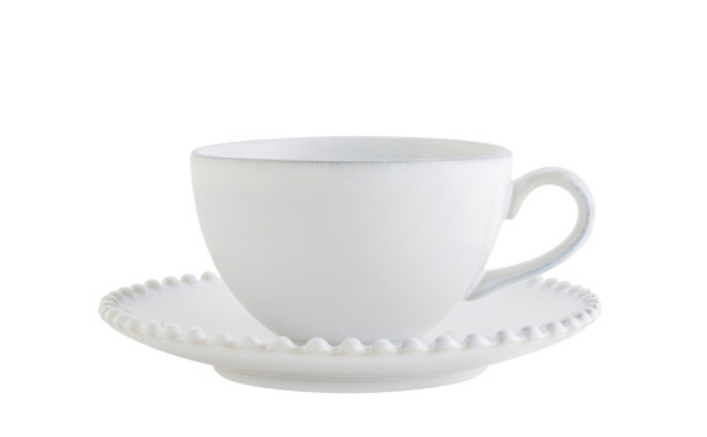
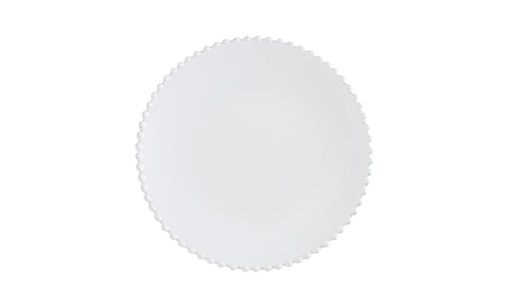
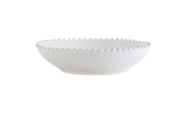
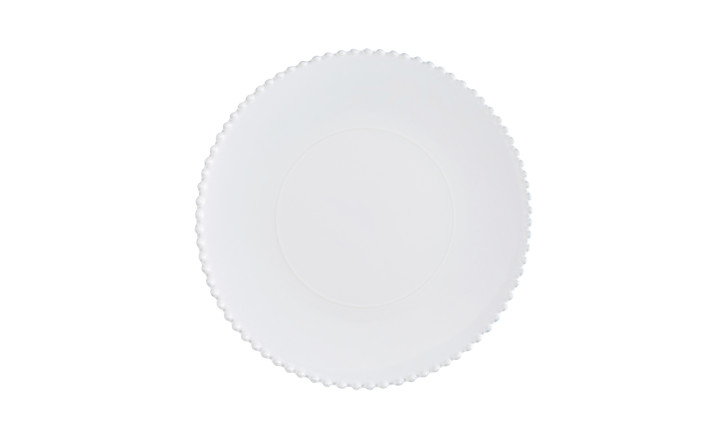
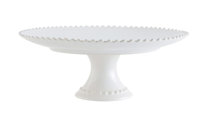
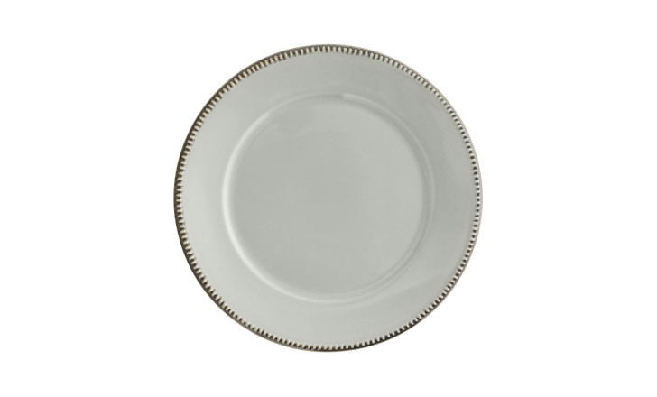
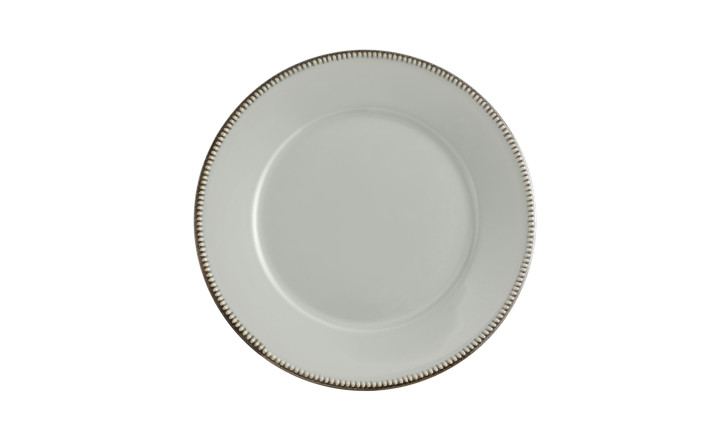
Pearl: the oldest decoration in the room
Run your finger along the edge of a Pearl piece and you will find a border of small raised beads, spaced with quiet regularity. The motif is older than it looks: bead-and-reel moulding appears in ancient Greek and Roman architecture, migrated into silver and goldsmithing in the Renaissance, into porcelain in the eighteenth century. Meissen used it. Wedgwood used it. There is something about the rhythm of repeated small forms that the eye finds deeply satisfying – the visual equivalent of a steady pulse.
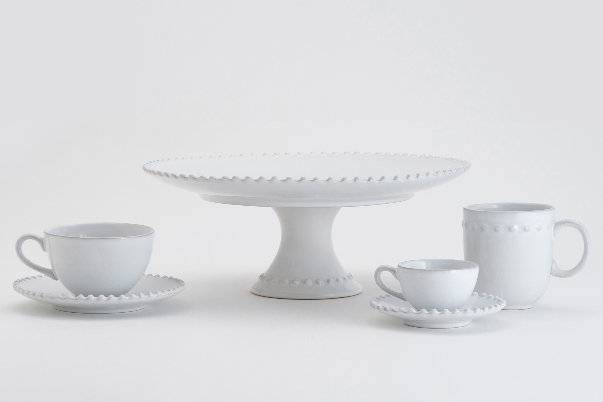
What makes Pearl work at a modern table is its restraint. The beading is the only gesture the design makes. Everything else – form, glaze, white – is utterly plain, so the decoration never competes with the food, the flowers, or the conversation. A mug, a tea cup and saucer, an espresso cup, a cake stand. Currently on sale at Dantone Home.

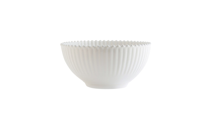
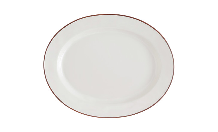
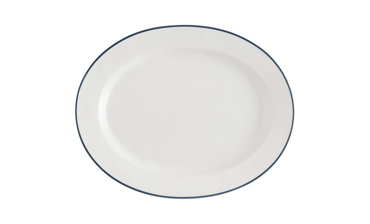
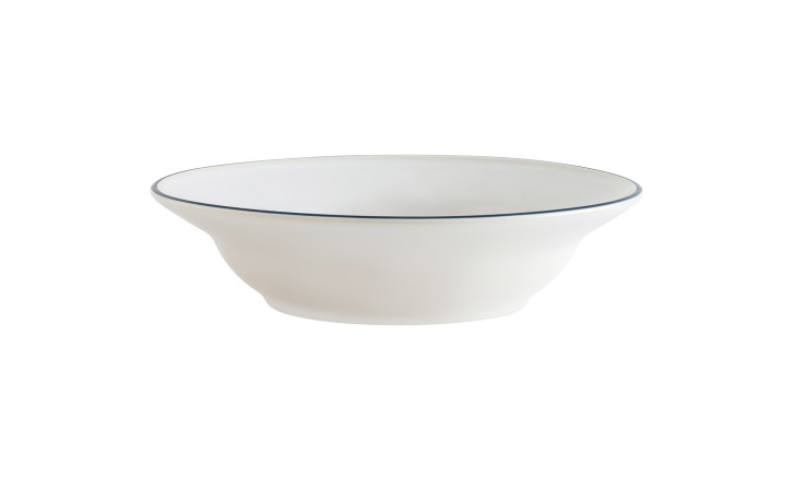
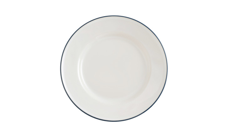
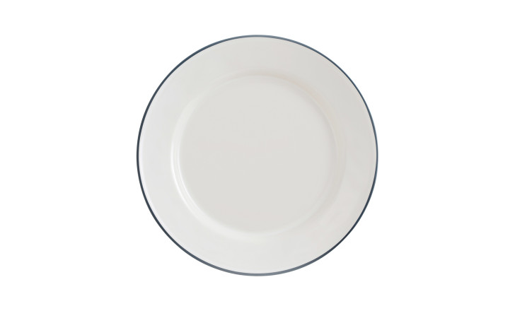
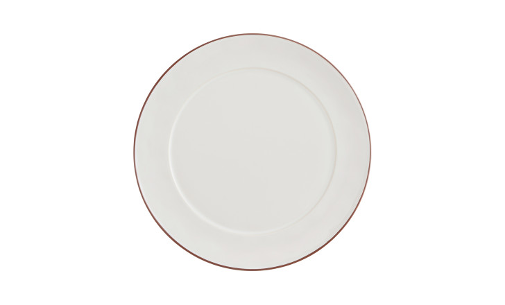
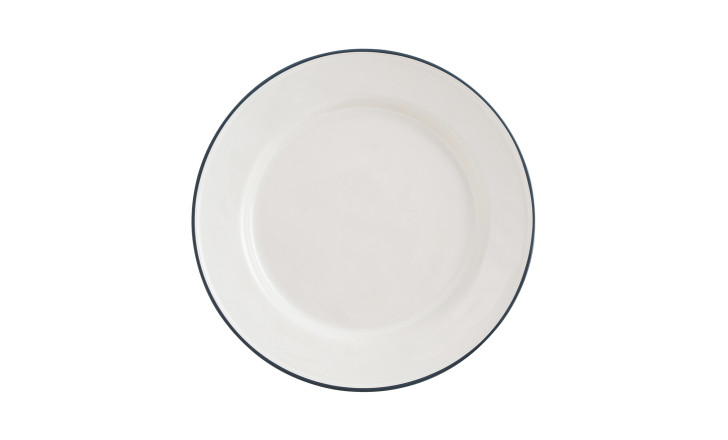
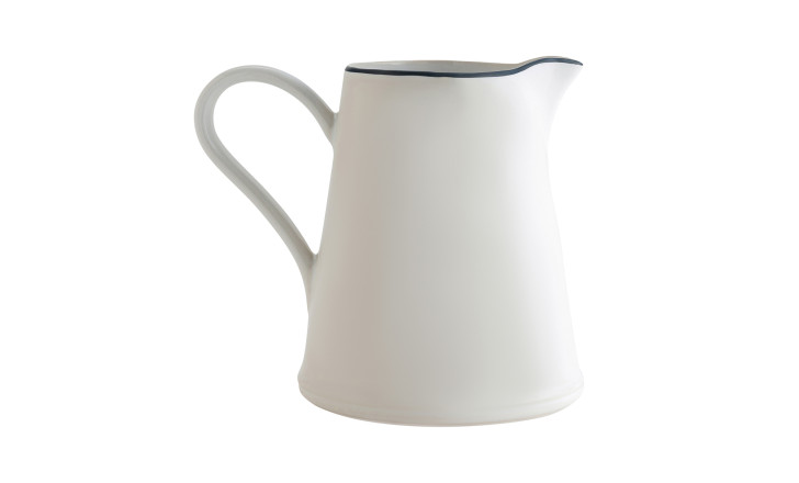
Beja: one line, nothing more
In Japanese aesthetics, “ma” (間) is usually translated as negative space, though that loses something. “Ma” is the pause between notes that gives music its meaning: the gap a composition asks the eye to cross, and in crossing, understand the whole. The Beja collection is, in its way, a study in that idea: a clean white body, a single fine line at the rim – available in dark red-brown or soft blue, and nothing more.
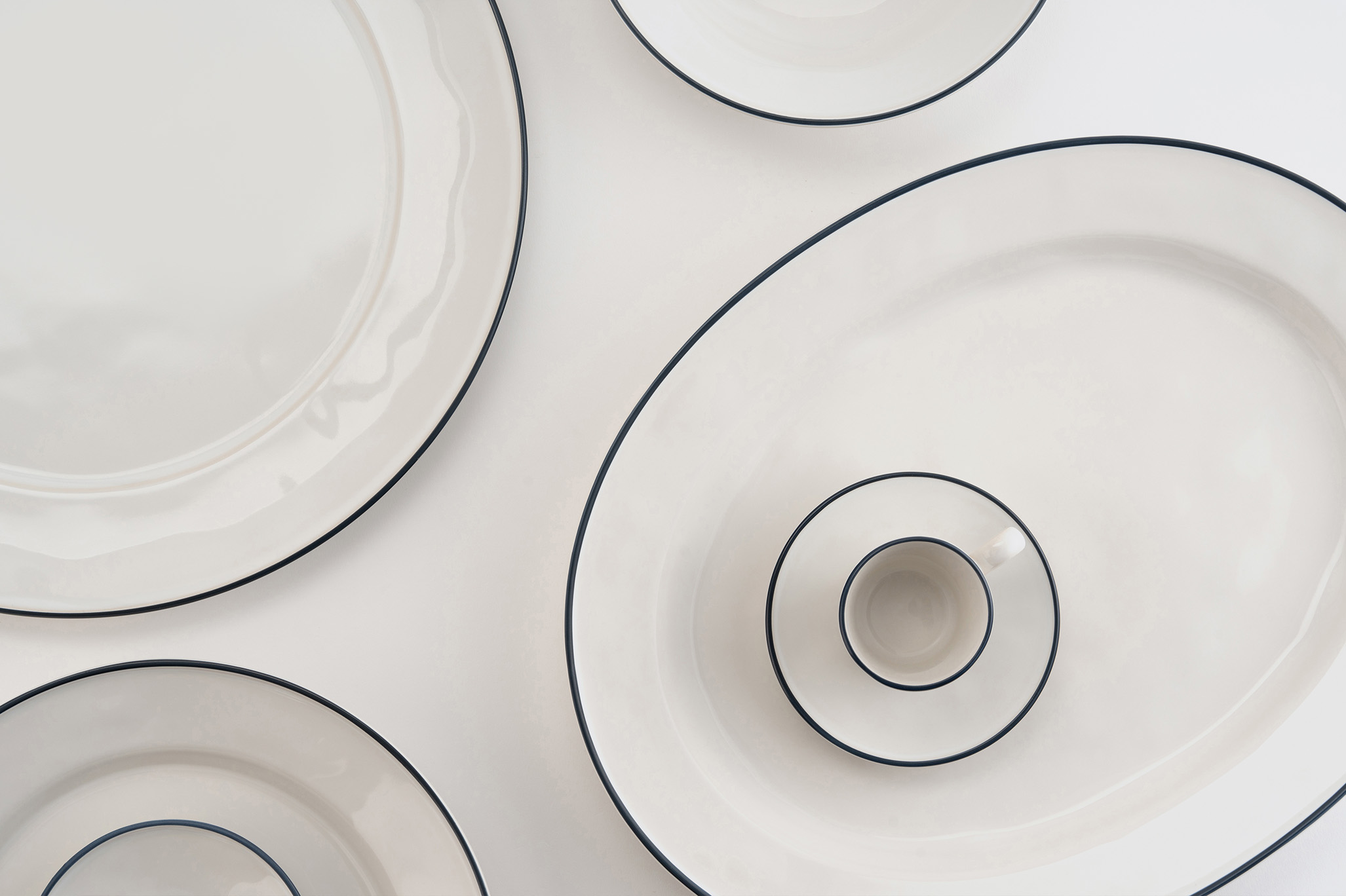
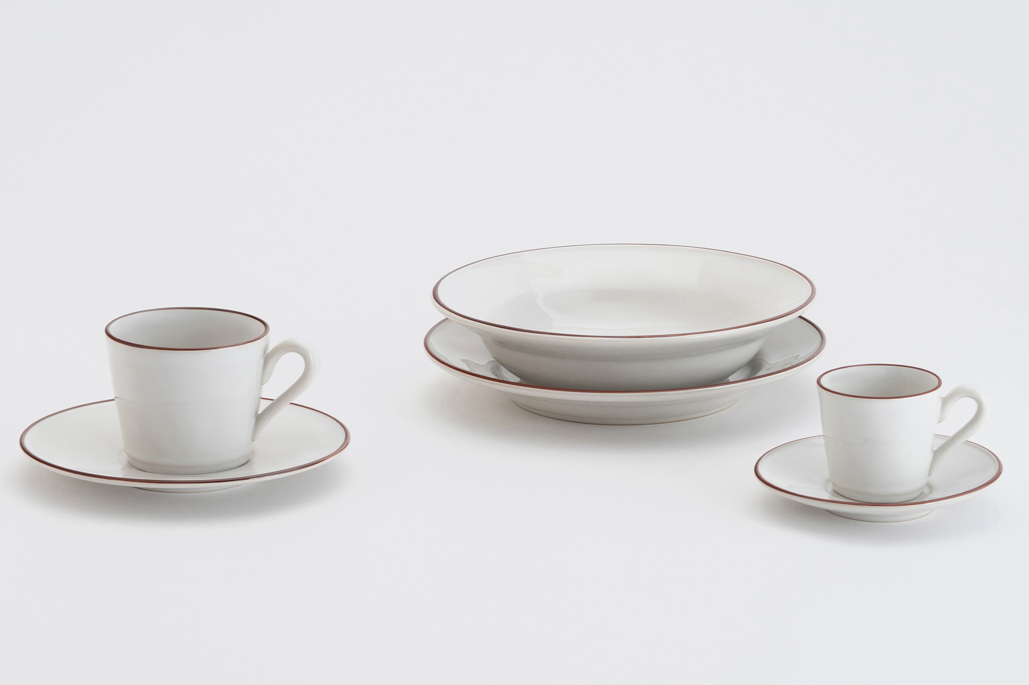
The restraint requires more confidence than elaboration. Anyone can add detail; knowing what to leave out is harder. At a table, Beja recedes in the best possible way – the food comes forward, the conversation comes forward, and the crockery simply holds things. Currently on sale at Dantone Home.


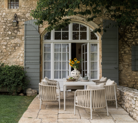
When someone says "I love these plates", having a story behind them makes the moment bette
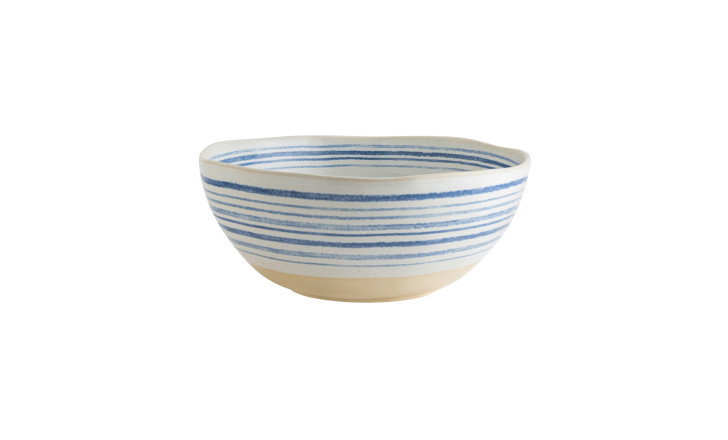
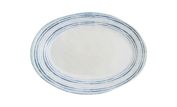
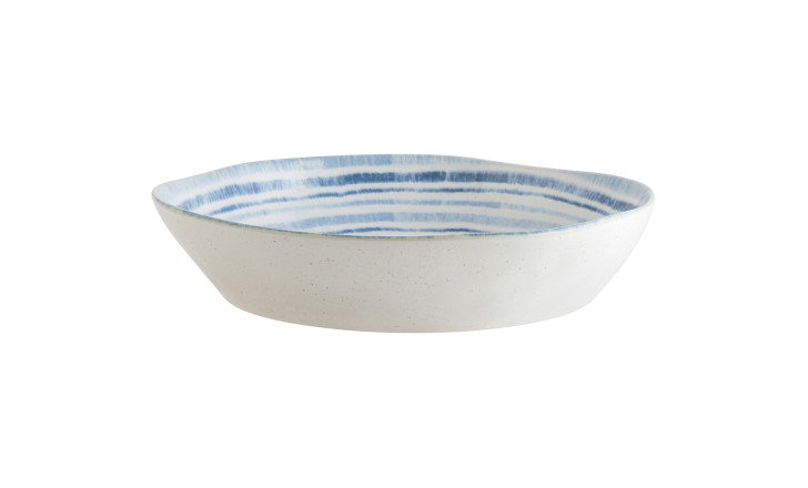
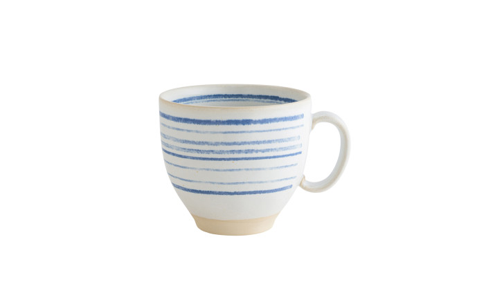
Nantucket: when the hand shows
Look closely at a Nantucket piece and the blue stripes are slightly uneven, varying in weight, spacing, depth of colour. Each stripe is applied individually by hand, which means each piece is, in the strictest sense, unique. The British potter Bernard Leach spent his life arguing for exactly this quality: that the slight irregularity of the handmade distinguishes an object from a machine-produced copy of itself, and that the trace of the maker is something to be valued rather than corrected.
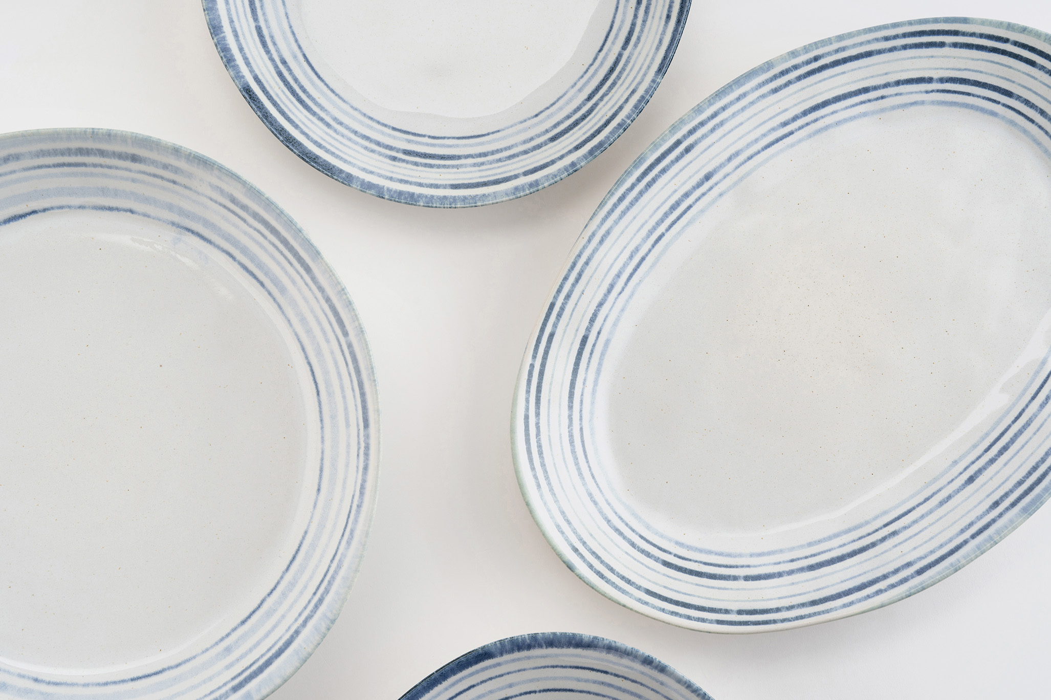
The blue-on-white palette has a long history – Delftware, Blue Willow, the coastal ceramics of Portugal and Greece – but the Nantucket interpretation is quieter than most. The stripes are soft, almost chalky, as if drawn in watercolour. The clay body at the base is left unglazed, showing its natural warm beige. A piece entirely comfortable being what it is.
Luzia: in praise of grey
Grey is more difficult than it looks. In ceramics especially, the glaze changes in the kiln, and the grey that enters the fire rarely matches the grey that emerges. Achieving a true, settled dove grey requires both precision in formulation and a certain acceptance of what the process will do on its own. The Luzia collection achieves it: cool without being cold, matte without being chalky, consistent enough to read as intentional without looking industrial.
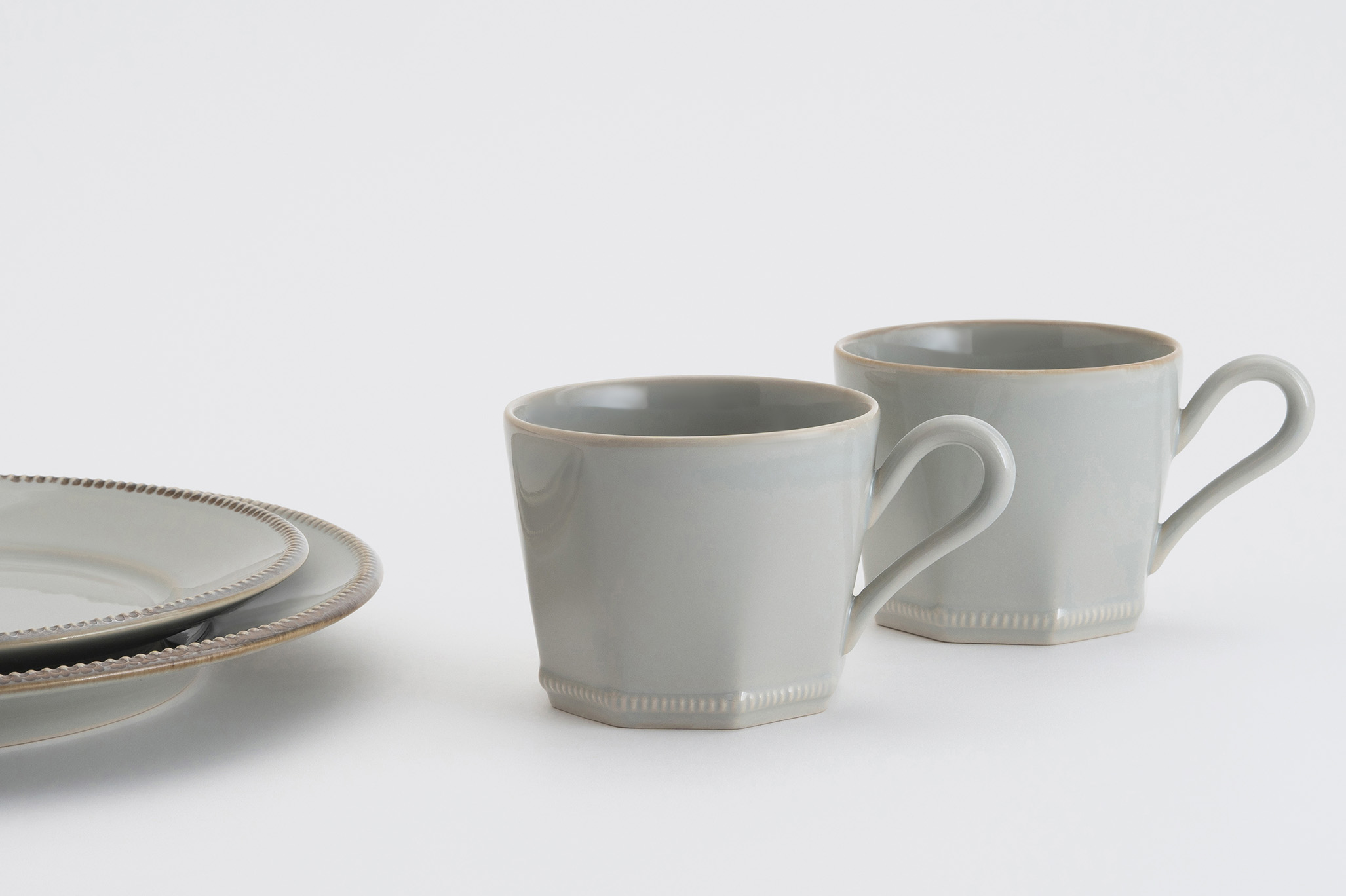
Grey entered the modern interior vocabulary seriously with the Arts and Crafts movement's preference for muted, natural tones over the saturated colours of Victorian decoration – and has never really left. At a table, it agrees with everything: white linens, dark wood, candlelight, morning light. A colour that knows how to be present without insisting on it.

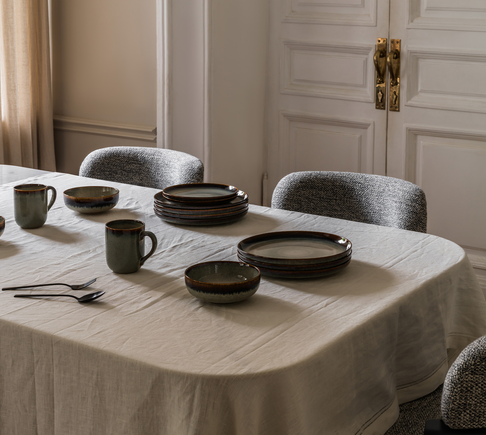
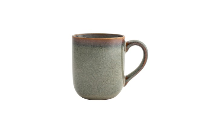
Moana: what the fire decides
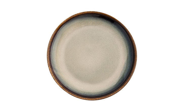
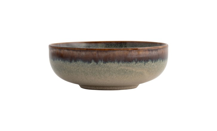
In Japanese ceramic tradition, “yōhen” (窯変) refers to the unpredictable transformations that occur when glaze, clay, temperature, and atmosphere interact in ways the potter cannot fully control. Historically, “yōhen” pieces – where the fire has done something unexpected and beautiful – have been among the most prized. The element of chance is a collaboration, not a flaw. The Moana collection works on exactly this principle: reactive glaze that shifts and bleeds during firing, producing different tonal results across each piece.
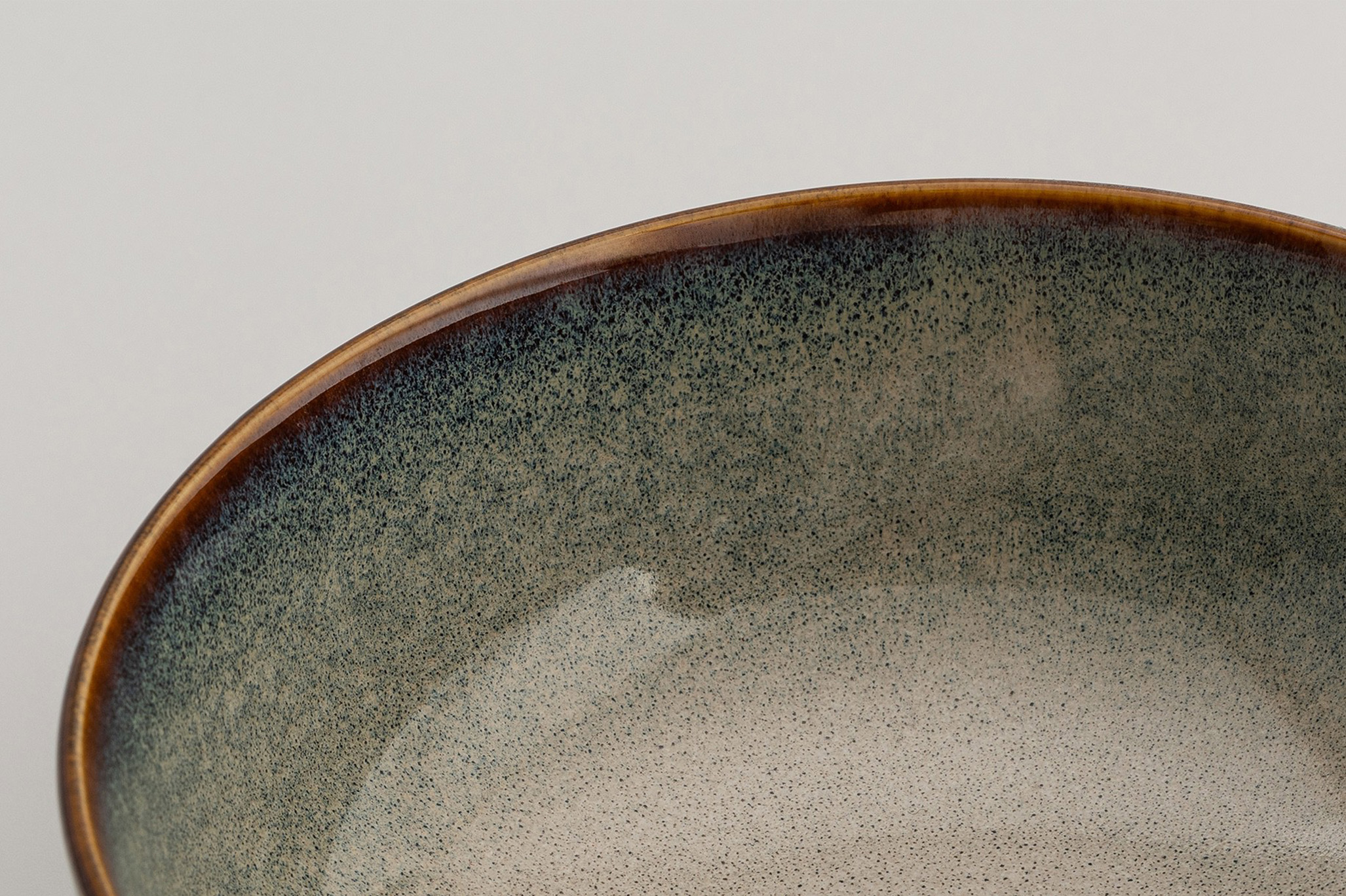
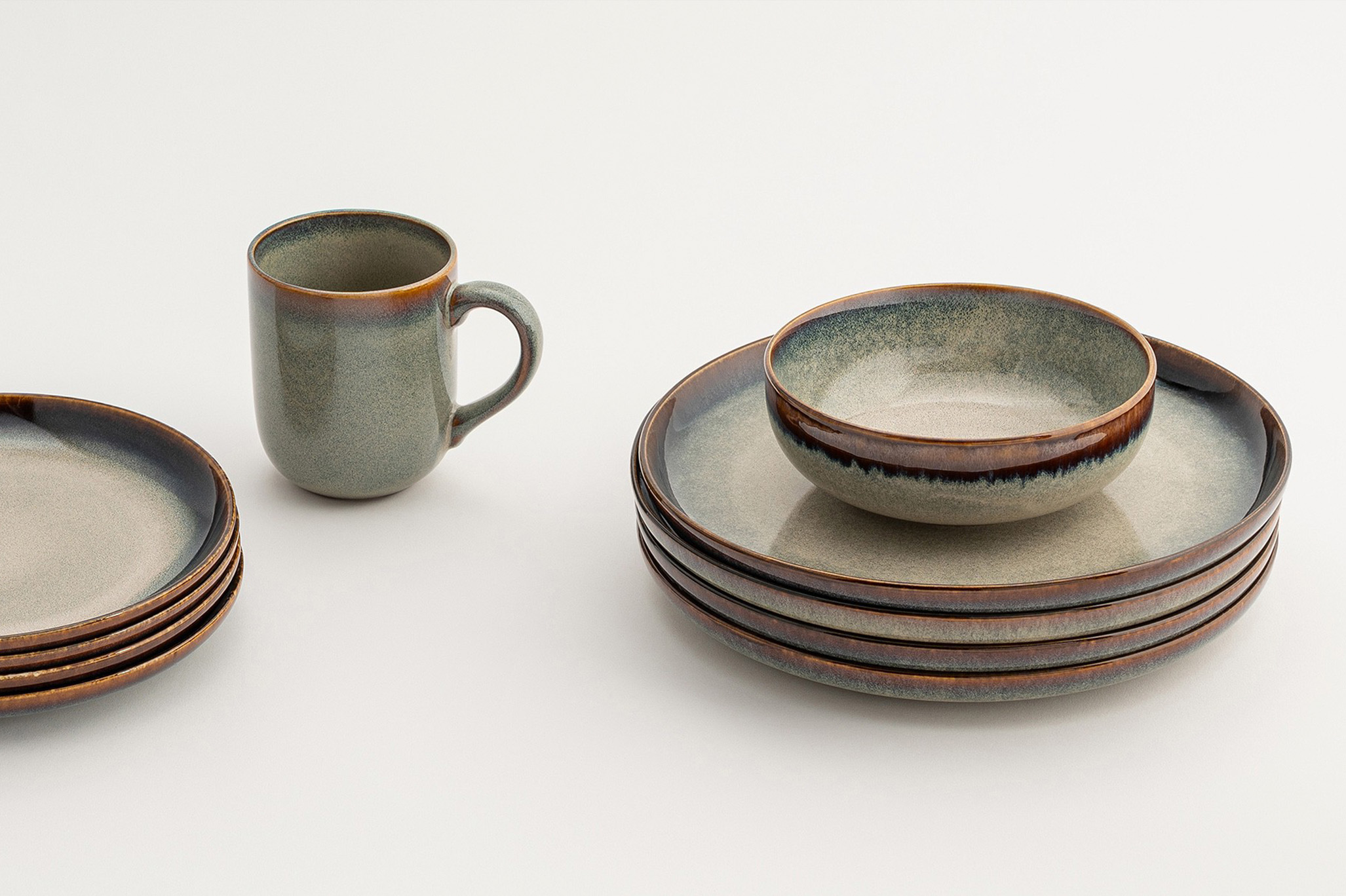
The effect is extraordinary: deep earth-brown at the rim moving through rust and amber into cool grey-green at the base, as though each piece contains its own landscape. Against a plain table, Moana stops the eye the way a very good painting does: not by being loud, but by having something genuinely worth looking at.

The stories are already there, they just need a table to be told at