
European by Design: The Names Who Shape Dantone Home

A name on a drawing is not a label for the sake of prestige. It is a record of who decided how deep the seat would be, how the door would open, and what the surface would look like after five years of use. Those decisions are invisible when they are right and impossible to live with when they are wrong.
Four people, four countries, and one question asked four ways: what should this piece do for someone who lives with it every day?
A house is never furnished in one go, and rarely by one hand. What keeps it together is not a single style but a shared standard: the same care given to the back of a sofa as to the front of a drawer. The four designers below work in four countries and in four completely different registers, and their pieces sit in the same room without argument, which is the whole point.
James Patterson

British, a furniture developer by training and a cabinetmaker by instinct, Patterson has worked with Dantone Home from the beginning and helped shape what the brand looks like. His subject is depth: what happens to a flat surface when you cut into it, and how the same door changes between noon and nine in the evening. “From the smallest accent piece to the grandest furniture collection, each item should bring joy and beauty to its surroundings,” he says, and in practice that means a front you want to run a hand across before you open it.
Luxe
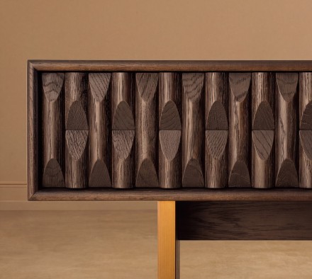
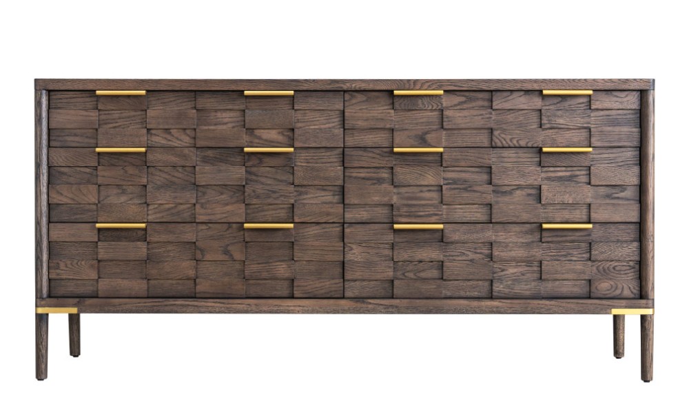
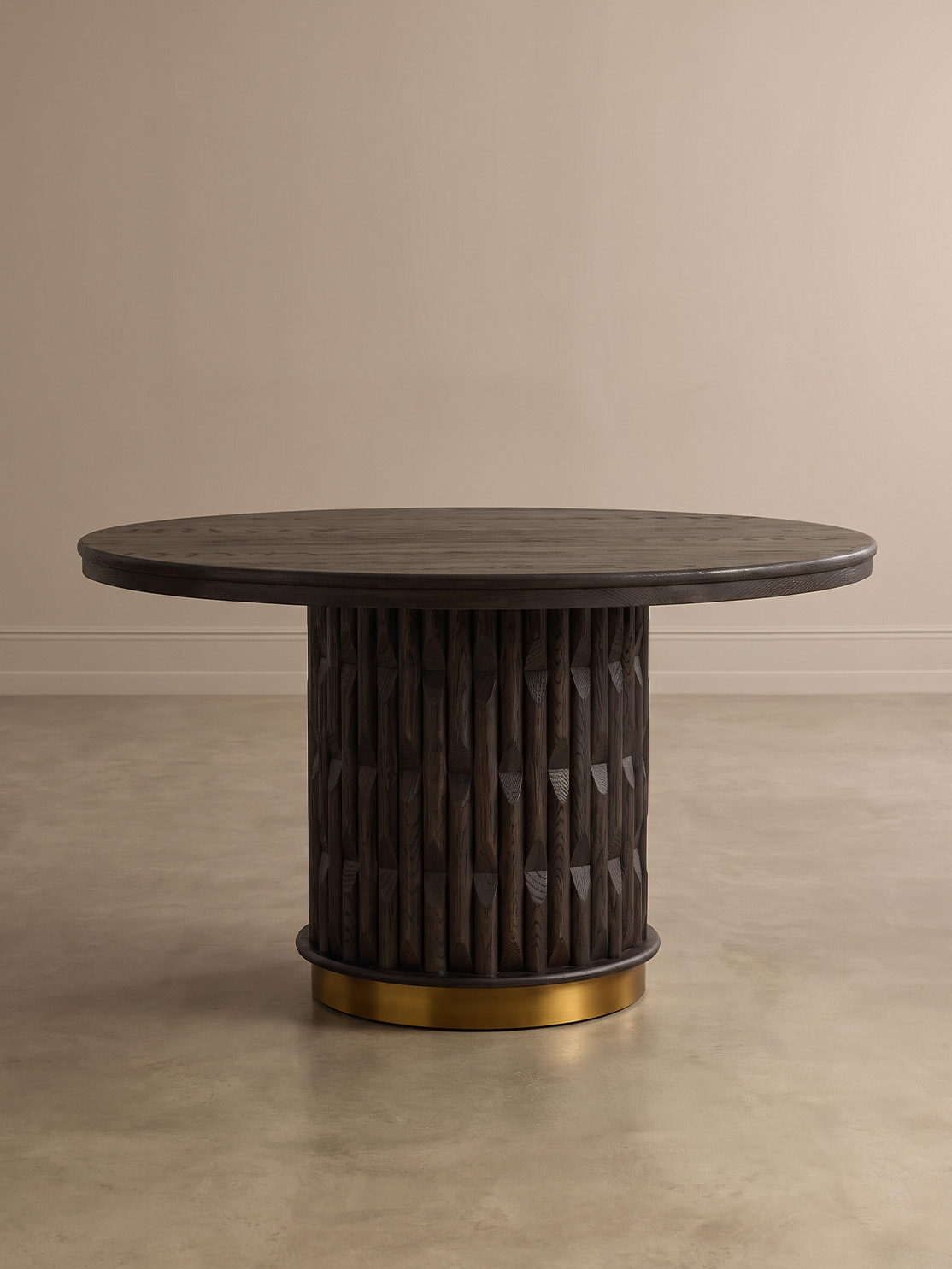
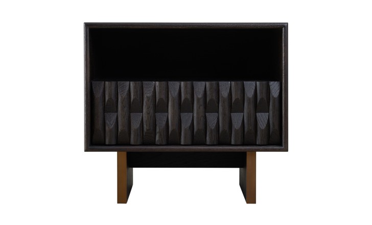
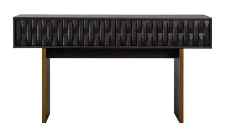
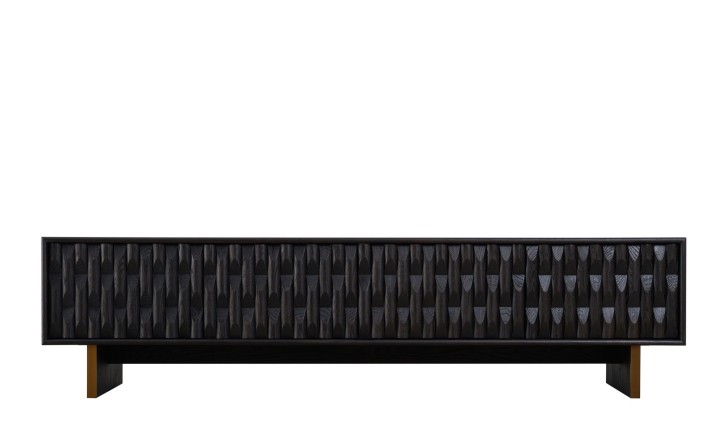
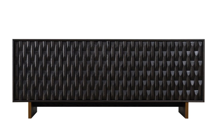
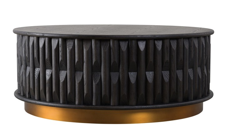
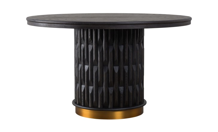
A limited edition of six pieces, and the most demanding thing Patterson has made here. Every surface is carved by hand into solid oak in a black-brown dry finish, on a plinth of solid brass 10 mm thick. Carving into solid timber allows no corrections: each cut is final, and the rhythm has to hold across a 193 cm sideboard without a break. The relief runs unbroken over the door joins, so four doors read as one panel, and there are no handles at all – the carving gives the hand its grip, which is also why the fronts stay clean. The brass lifts the whole mass clear of the floor, so nothing gathers underneath.
Rustic
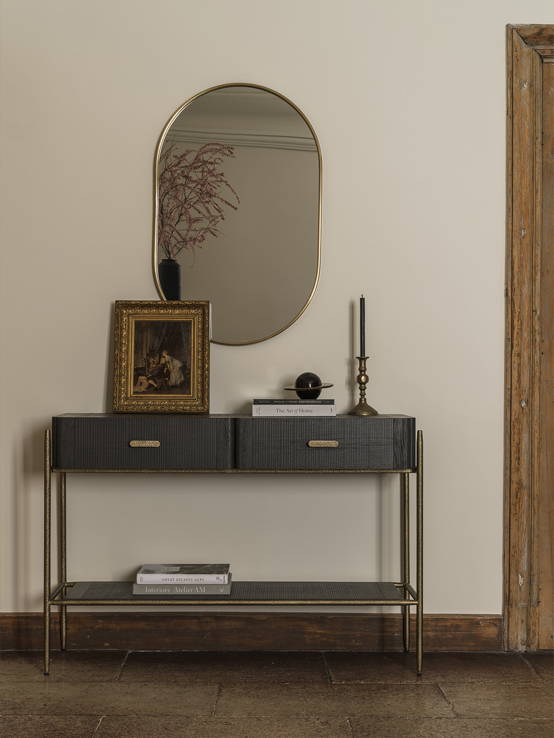
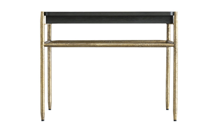
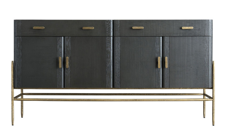
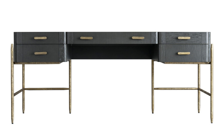
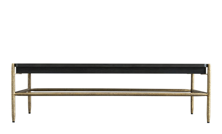
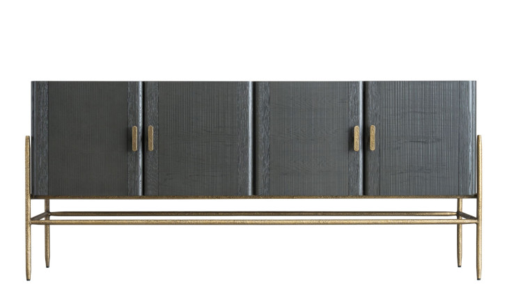
Oak with a surface that reads as though it has been passed through fire: a greyish cast and rhythmic grooves cut across the natural grain. Rounded corners and airy silhouettes come from mid-century furniture, the strict geometry from Art Deco, and the brass bases and handles cut through the smoky wood rather than blending into it. In a room it behaves like an old piece rather than a new one, which is useful when everything else is recently bought.

Textures
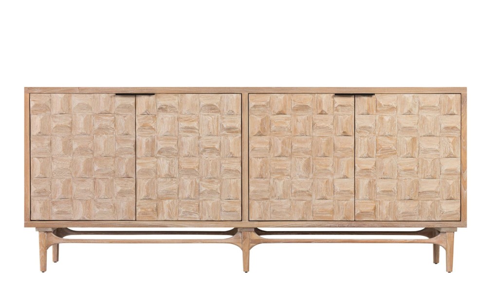
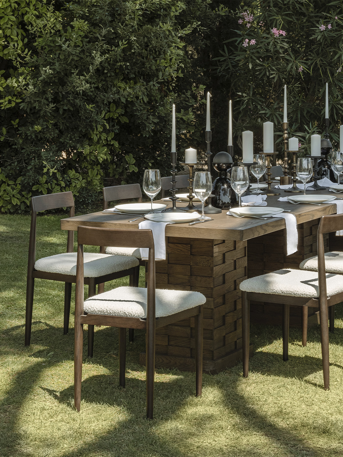
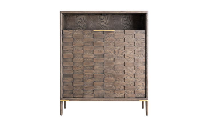
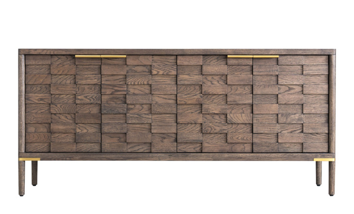
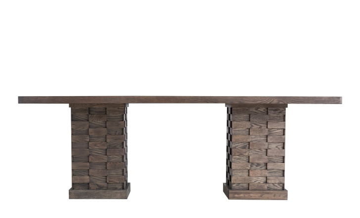
A collection that is best understood with the eyes shut. The fronts are built from wooden blocks whose natural pattern only comes forward when light crosses them, so the same cabinet looks quiet in daylight and deeply modelled under a lamp. “I am fascinated by natural materials, which are simple and honest yet allow for unlimited freedom of thought: a single piece of wood can become anything and everything,” Patterson says. Practically, a textured front forgives everything a flat lacquer front records: fingerprints, dust, the passing of a sleeve.
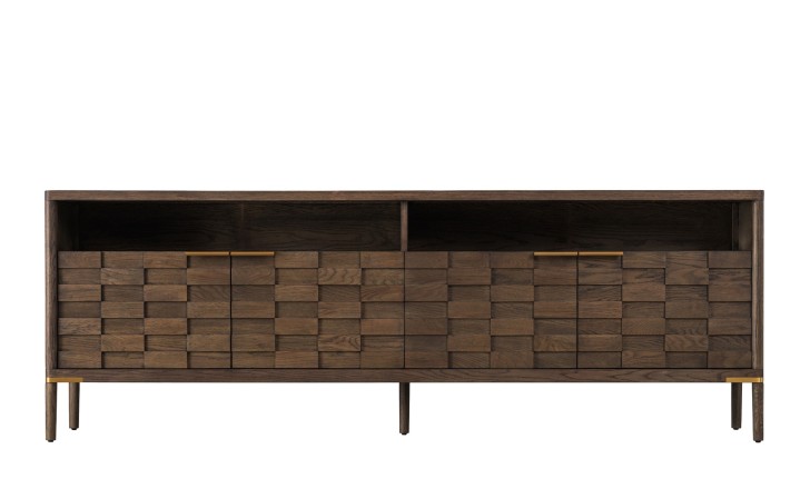
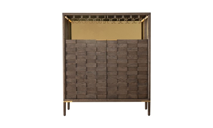
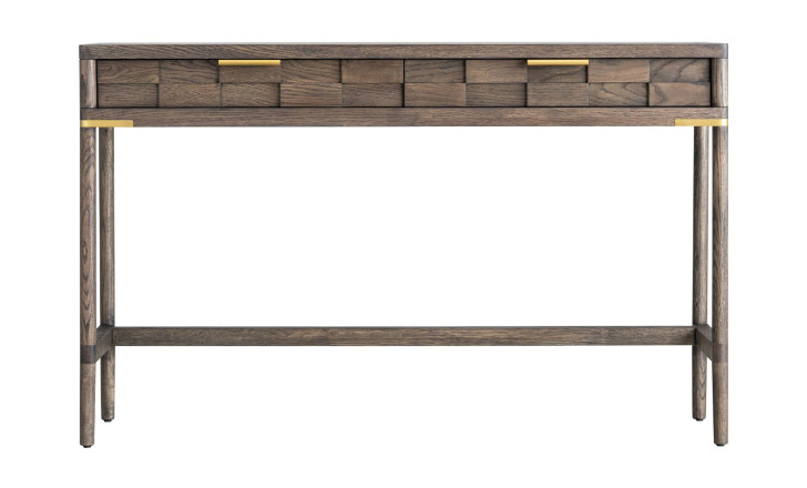
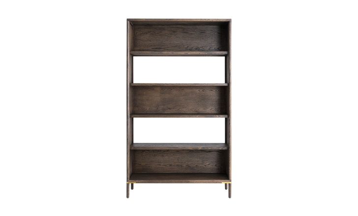


City in Black Oak
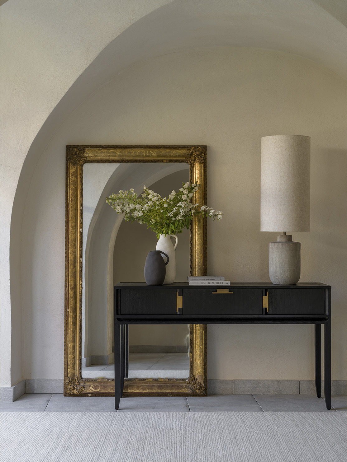
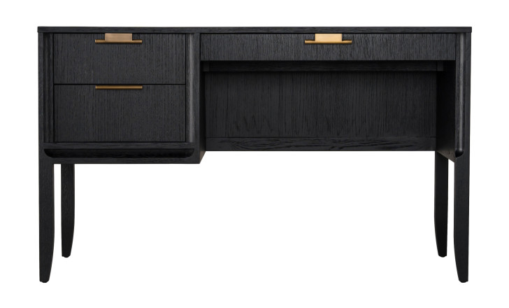
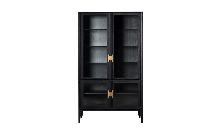
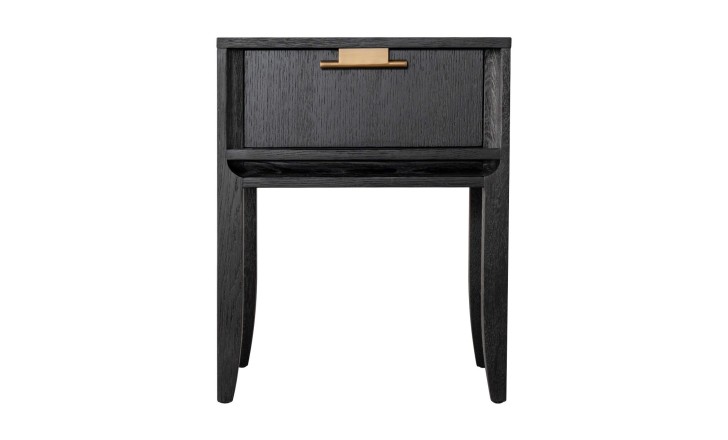
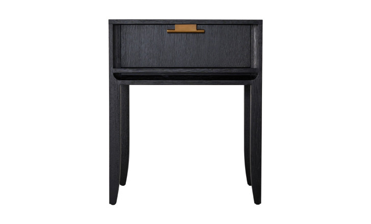
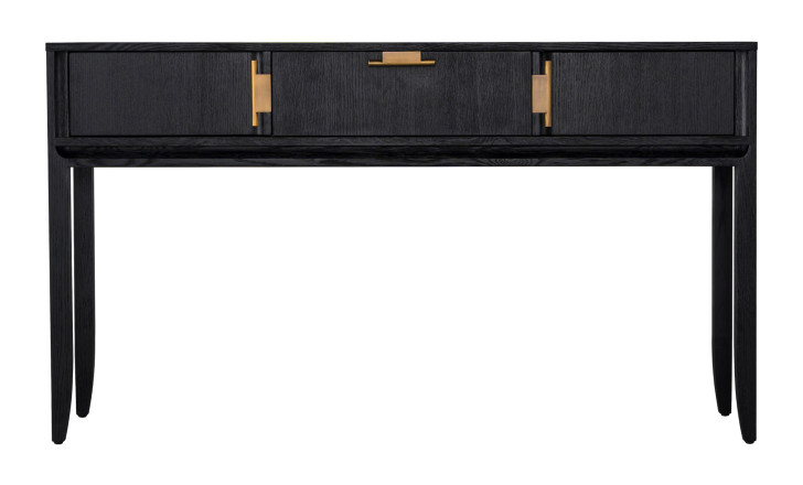
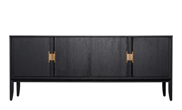
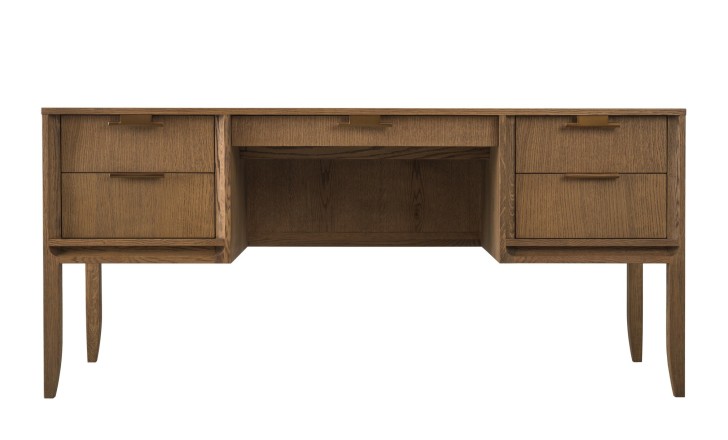
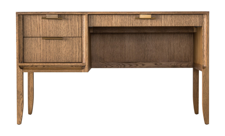
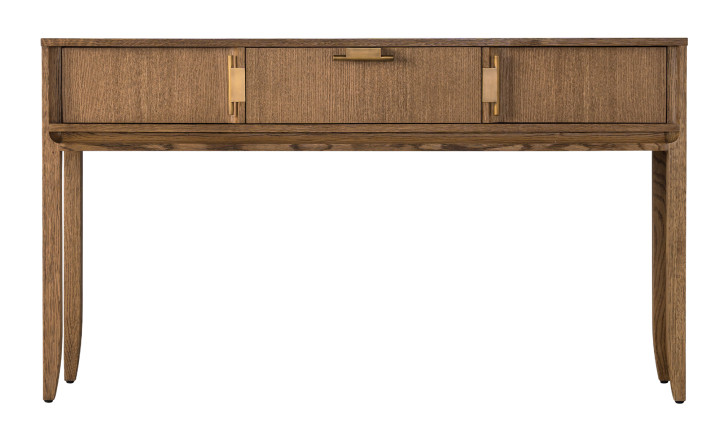
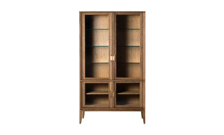
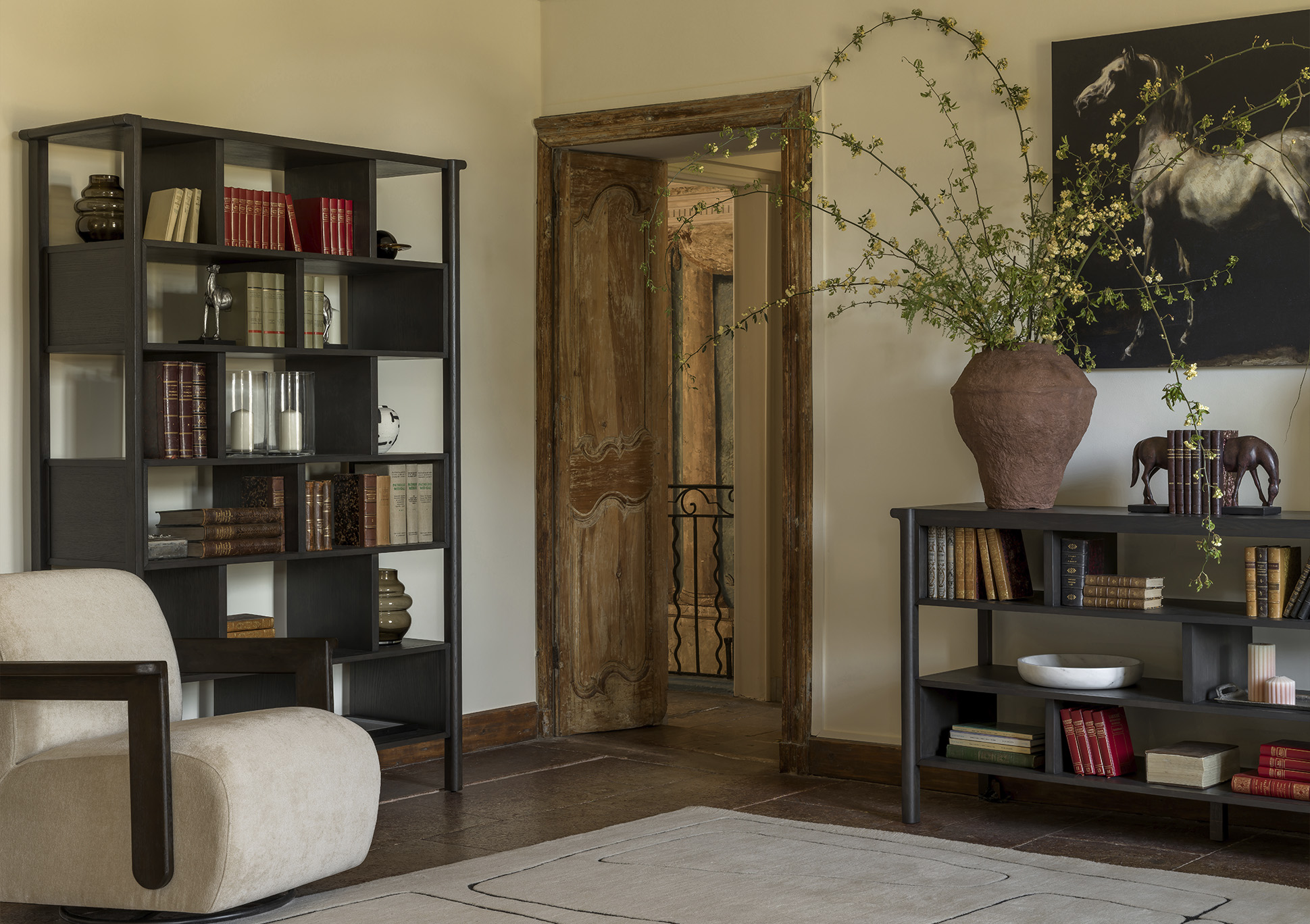
Noble oak and slim brass fittings, Art Deco proportion with contemporary function. The dark version is the one to use where a room needs an anchor rather than another light surface: against pale plaster it reads as a drawn line, and the tapered legs keep it from sitting heavily on the floor. The brass is used as line, not ornament, an edge and a handle, so the eye goes to where the hand goes.

City in Honey Oak
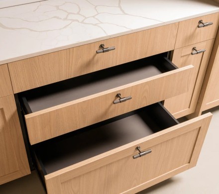
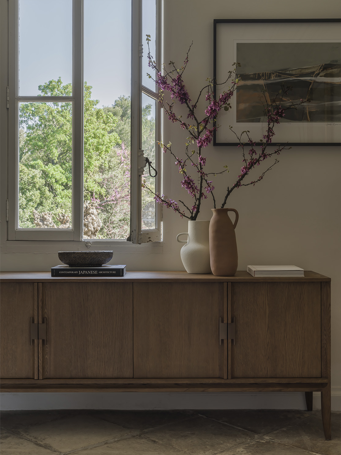
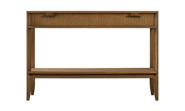
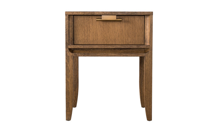
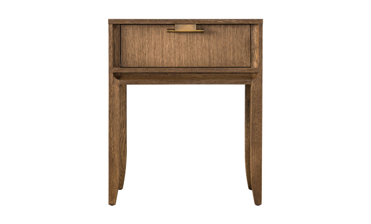
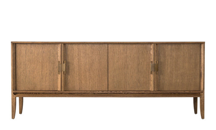
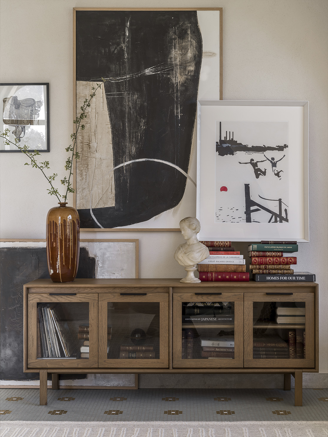
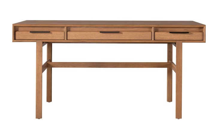
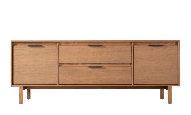
The same drawings in a warm mid-brown, and a different job entirely. Here the grain does the talking and the collection stops being a statement piece: a sideboard in honey oak sits under a window without competing with the view, holds a room together by tone rather than contrast, and looks better as the light moves across it through the day. Recessed vertical pulls keep the front uninterrupted, so the surface stays a plane of wood rather than a row of fittings.
Glamour
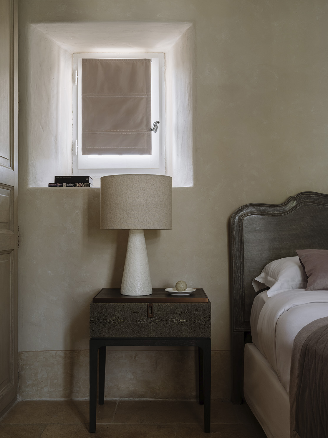
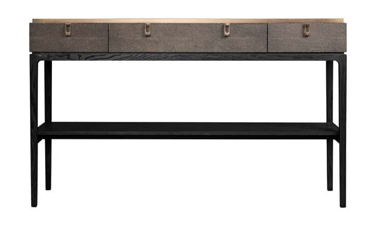
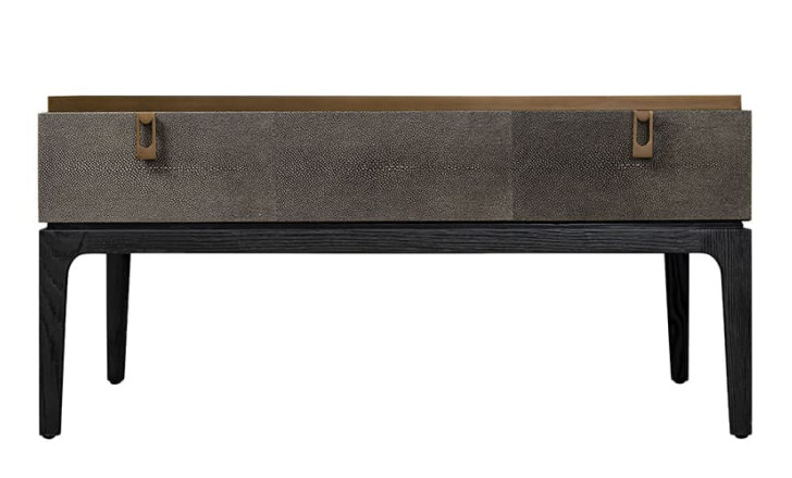
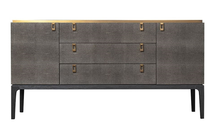
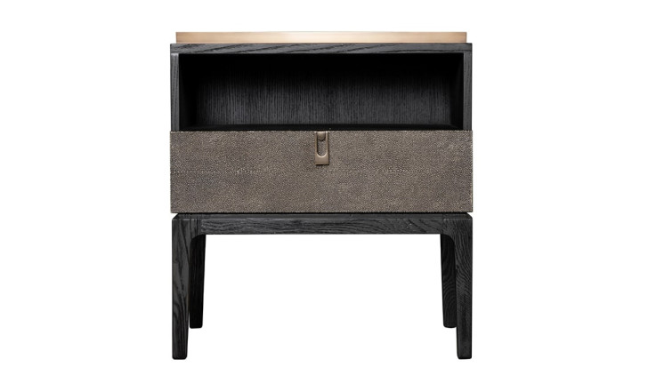
The dressiest thing Patterson has done here, and the most tactile: shagreen leather surfaces with a fine pebbled grain, elegant silhouettes, brass details drawn from British Art Deco jewellery. Leather on a cabinet front is a decision about touch and about wear – it warms under the hand, it does not ring when something is set down on it, and it takes on a patina where it is opened most, which is the part of ageing worth having.
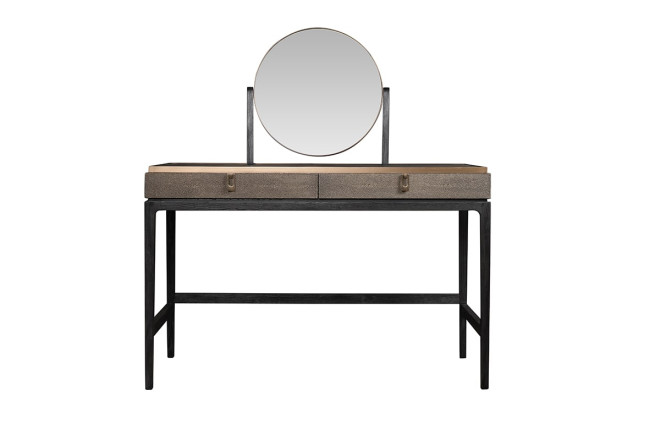
JP Line 6.0
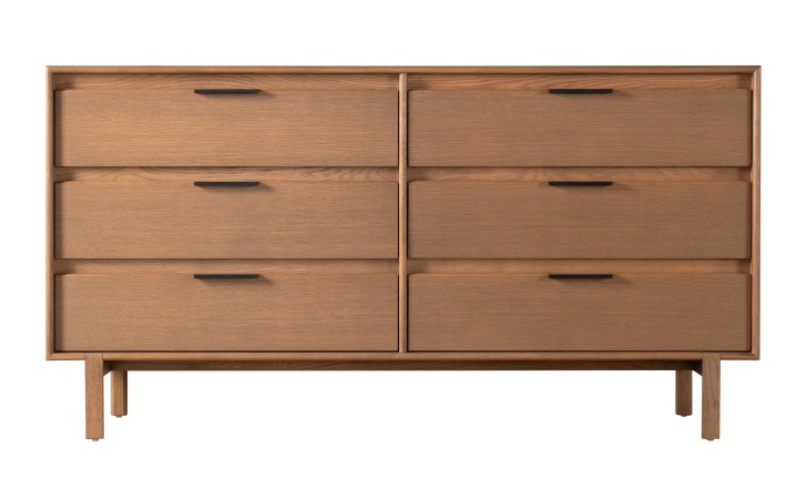
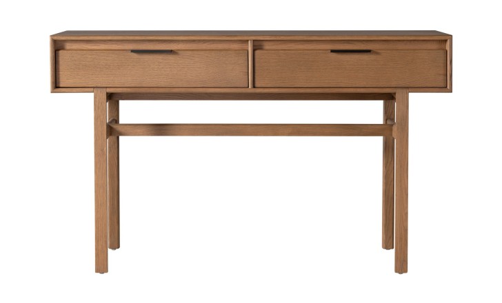
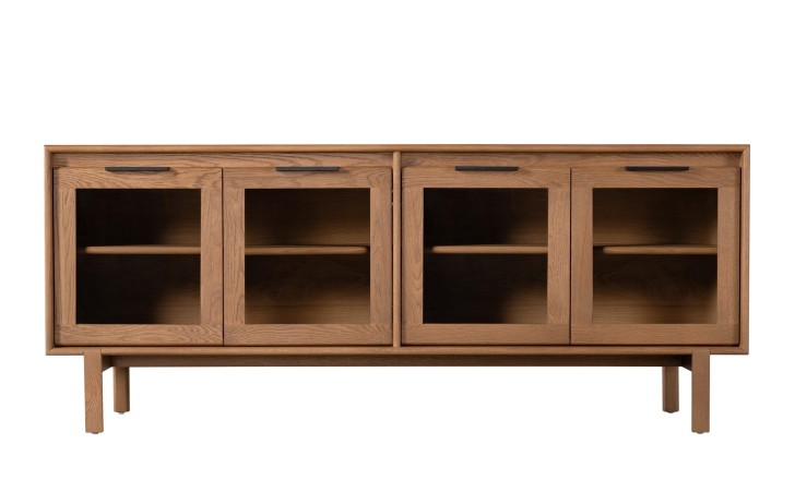
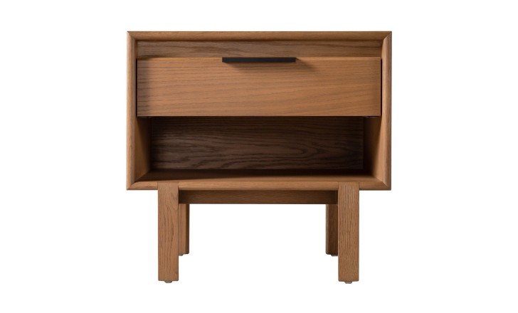
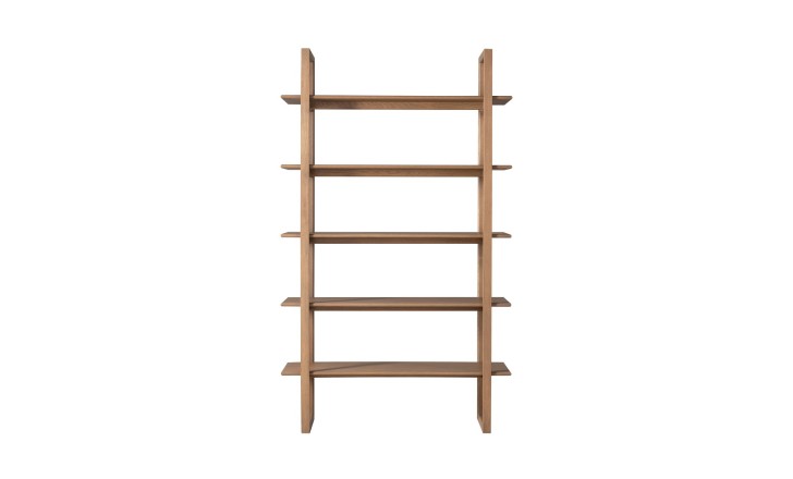
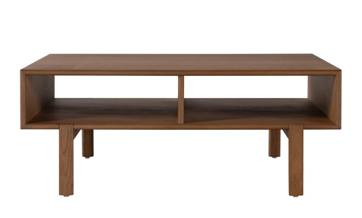
The name is literal: JP for the designer's initials, 6.0 because it was the sixth collaboration between Patterson and Dantone Home. The line it walks is between the 1950s and the present, and it stays on the right side of both. The forms are simple in the mid-century manner and carry a genuine vintage warmth, but nothing about them is museum-ish or heavy. What decides it is the finish: rounded edges cut into solid timber and sanded until the hand keeps returning to them, and a warm tone that lets the natural figure of the wood do the decorating. Pieces like this are easy to place because they were drawn before open-plan living existed and work in it anyway.

David Girelli

Swiss-born, based in the UK, with a background that runs through engineering, fashion and interior design before it arrives at furniture. Girelli builds from Scandinavian principles – traditional joinery, natural materials, no decoration that is not structural – and his pieces tend to lock together visually, geometry meeting geometry. “My main focus is to strike a balance between aesthetics, functionality, and meticulous attention to detail,” he says, “ensuring that the pieces I create are not only beautiful but also conducive to comfortable living.”
Bubble
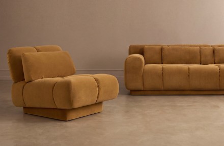
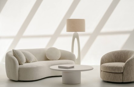
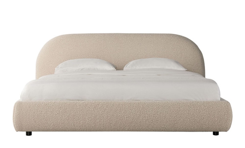
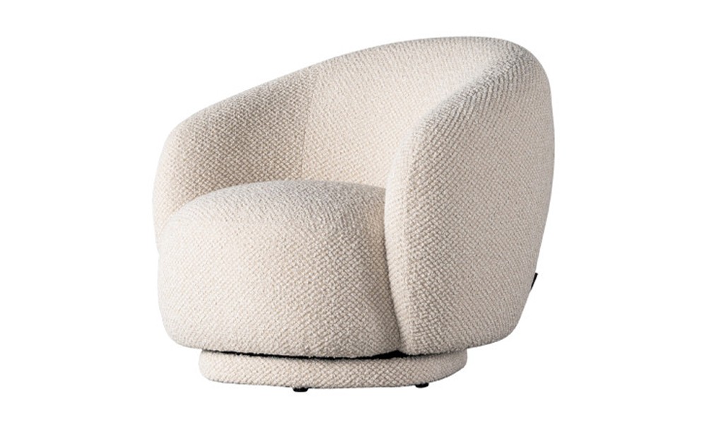
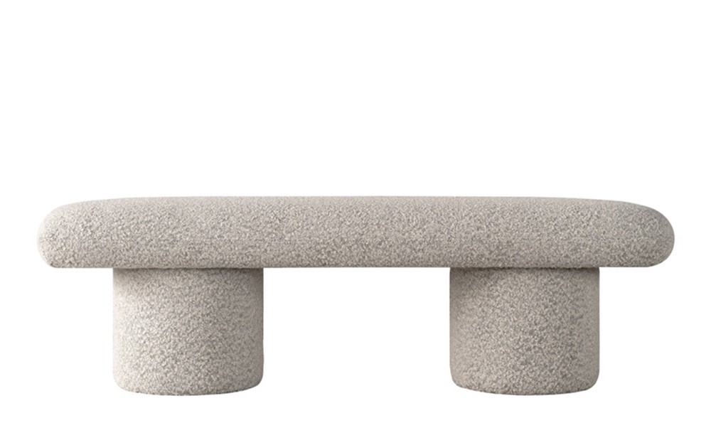
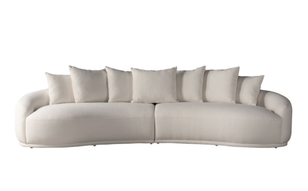
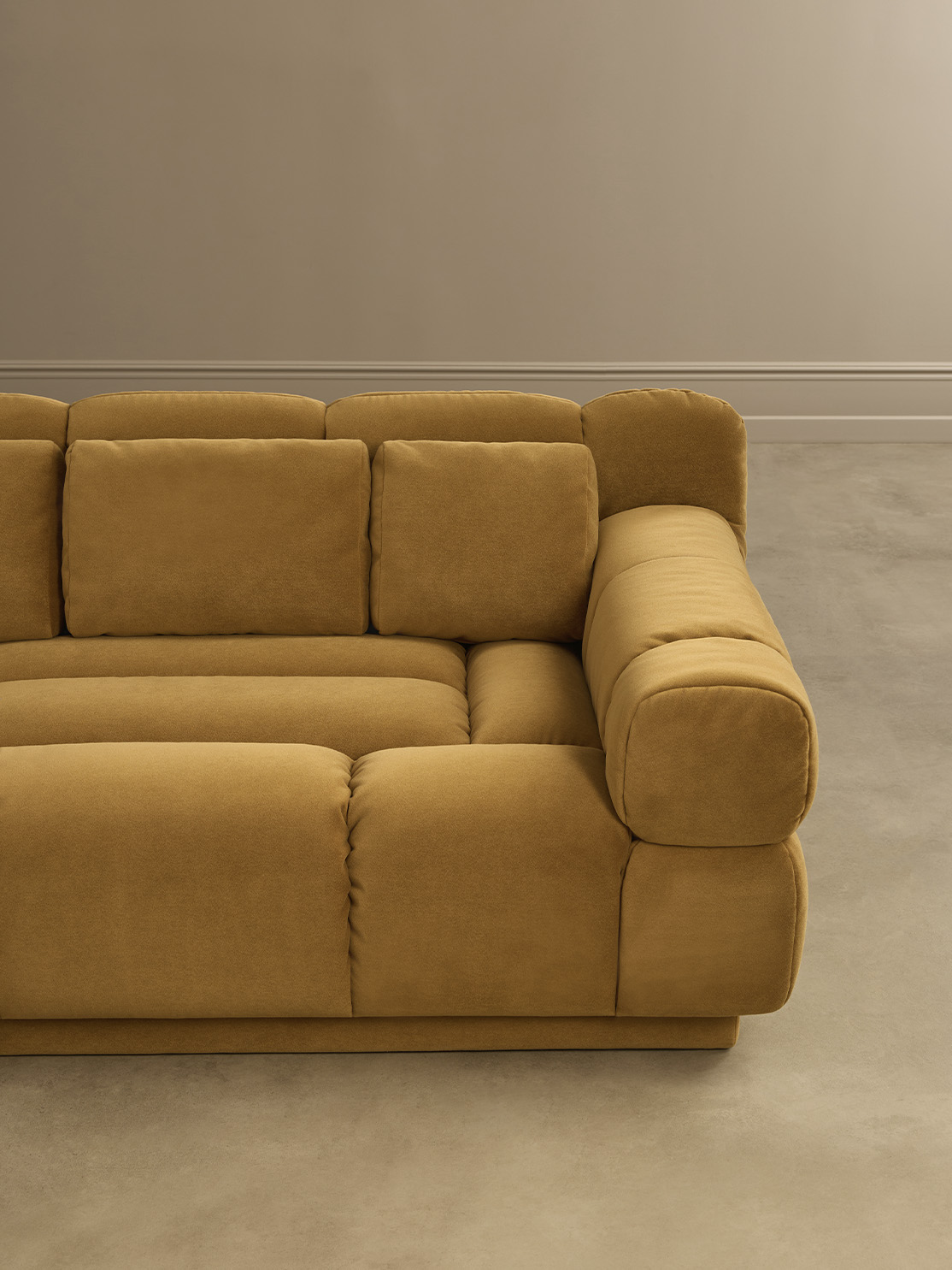
The newest of Girelli's ranges here and the one that breaks his own rules: where Contempo and Lines are built on straight geometry, Bubble is built on the absence of it. Dense, rounded volumes with no visible frame, no leg line and no hard edge anywhere, upholstered so the surface reads as one continuous piece. It is the softest thing in the catalogue to look at and the most forgiving to live with: nothing to catch a shin on, nothing to align against a wall, and a silhouette that stays generous even when the room around it is spare. Put it beside a carved or slatted front and it does the work a curve always does against a line.
Contempo
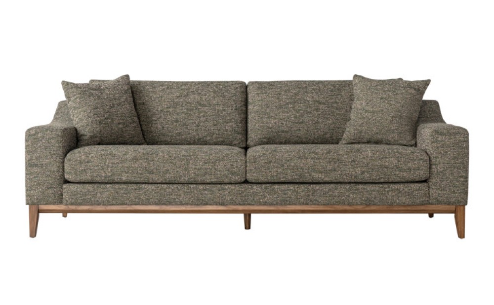
The first collaboration between Girelli and Dantone Home, and the one that set the tone for the rest. Scandinavian minimalism carried into something warmer, with an eye on European architecture and Japanese craft. There is no applied décor anywhere in the range: the interest comes from the joins, the interlocking shapes and the textured fabrics and leathers. It suits a room that is lived in hard, because there is nothing on the surface to damage.
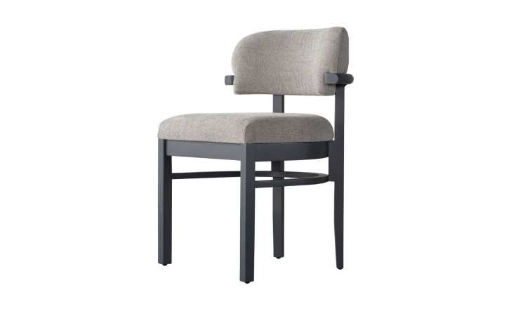
Lines
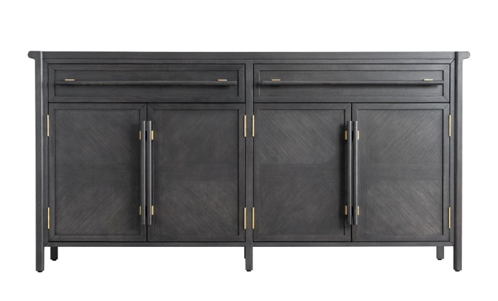
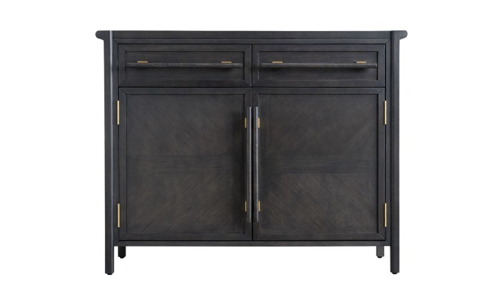
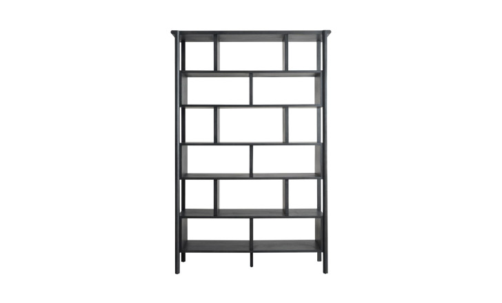
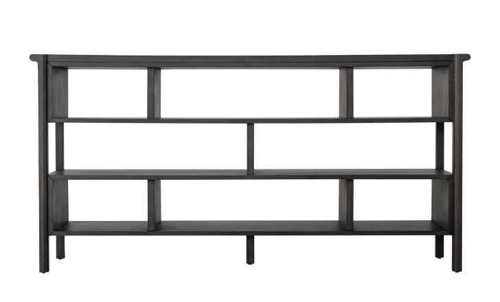
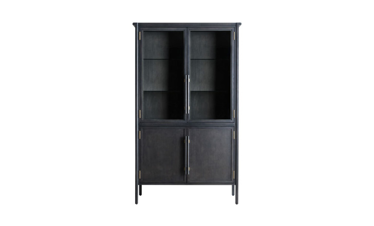
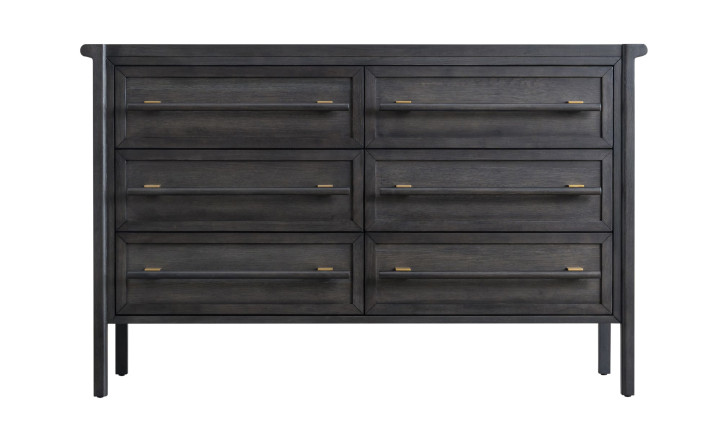
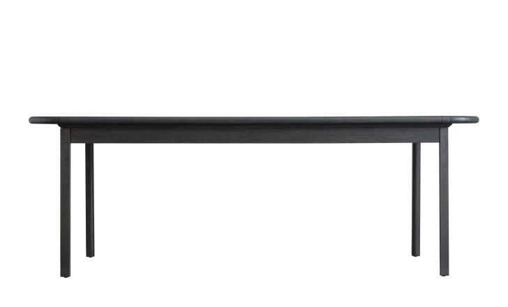
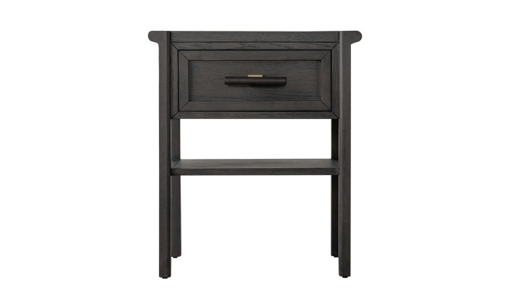
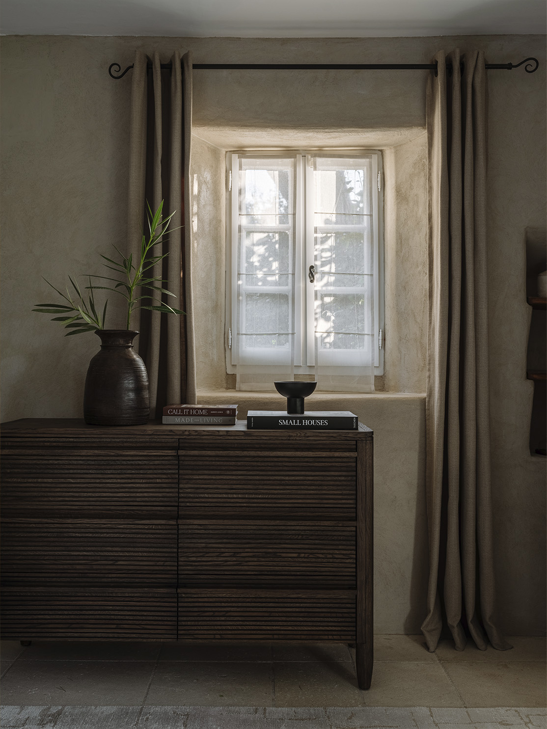
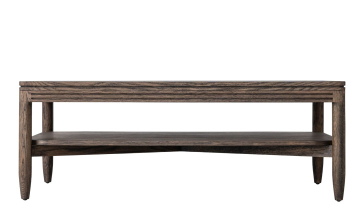
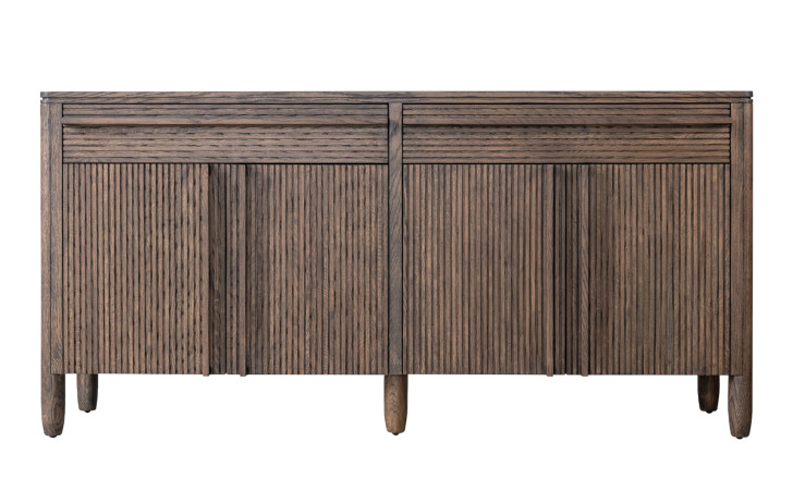
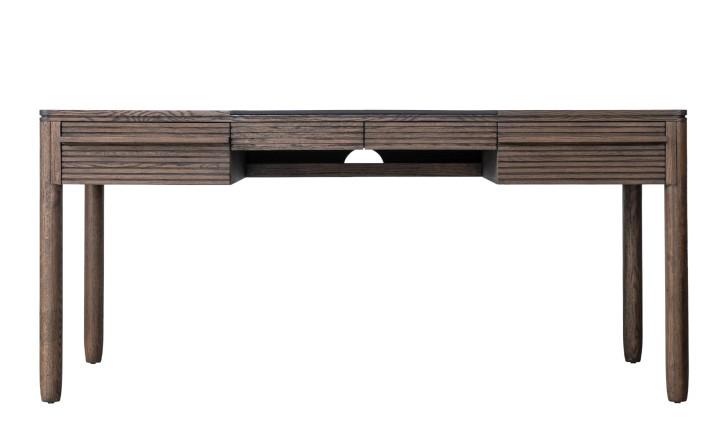
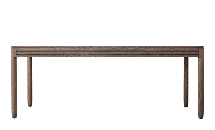
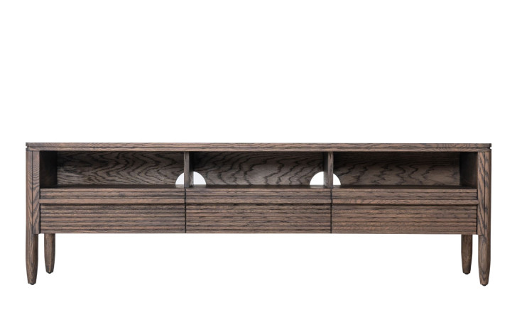
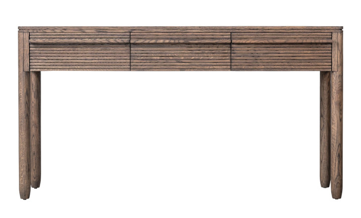
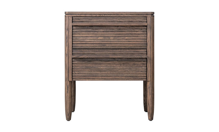
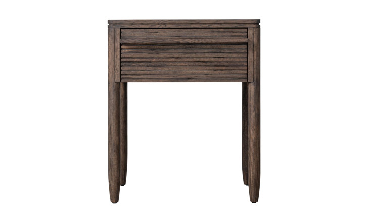
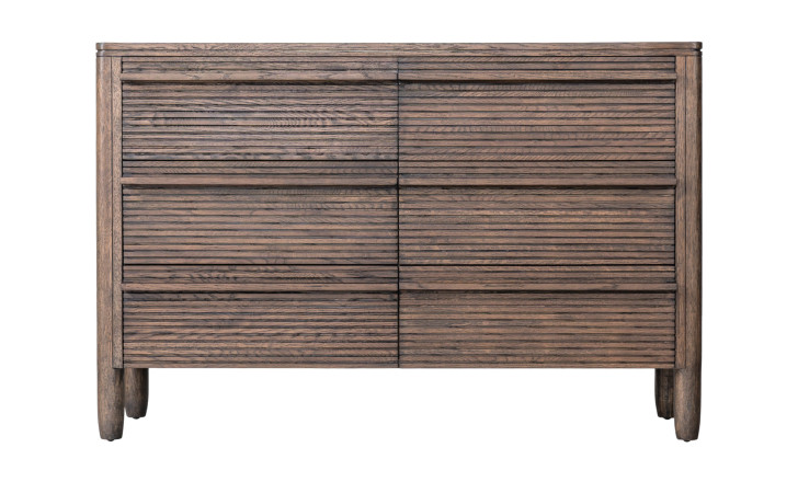
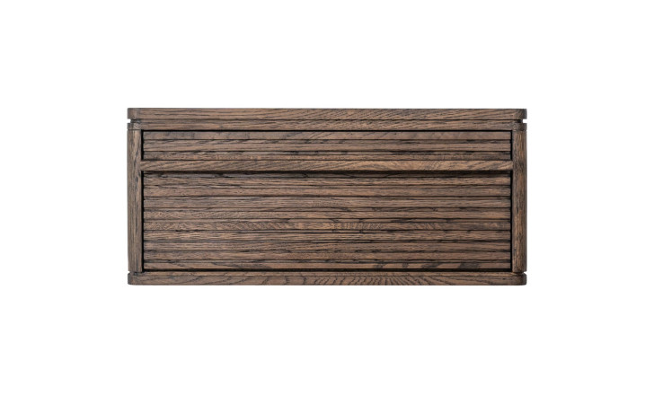
Modernist architecture translated to a cabinet front: parallel slats, clean geometry, the strict logic that came from building for function and efficiency. The charisma of the range sits in the contradiction – the silhouette is as plain as it gets, while the slatted facade carries the full pattern of the timber. Slats also do something quietly useful: they break up a large flat volume, so a tall wardrobe or a long sideboard reads as lighter than its actual size.
Scoop
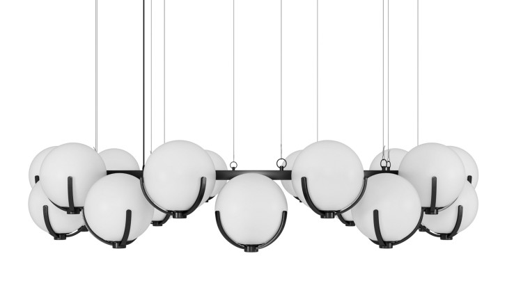
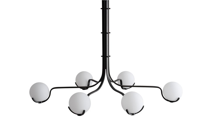
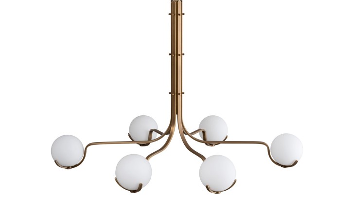
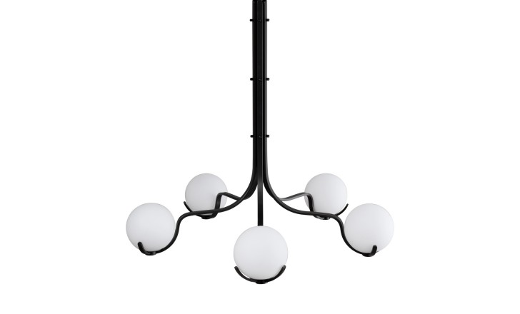
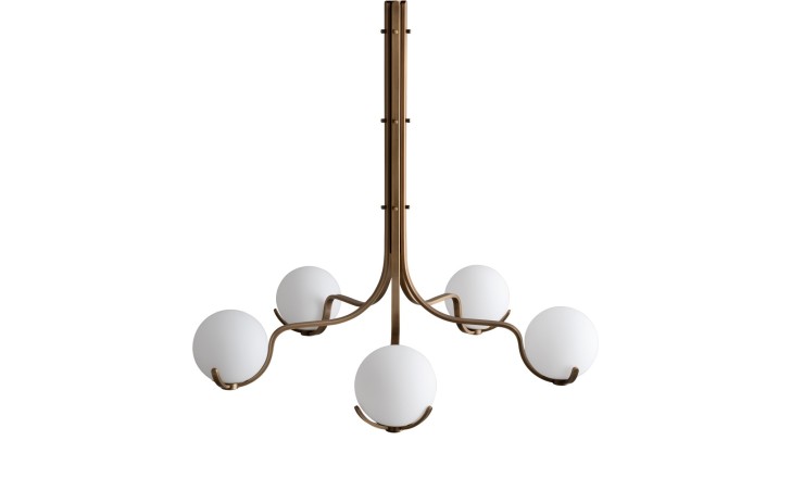
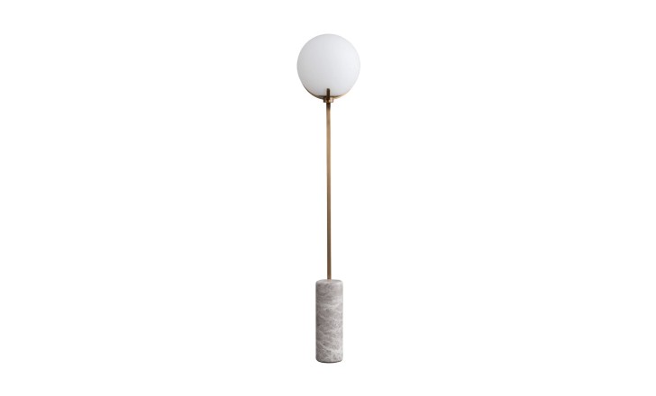
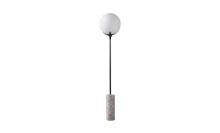
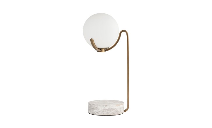
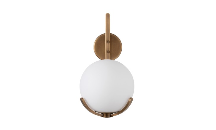
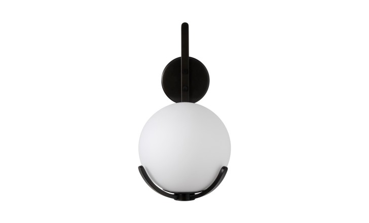
A lighting collection made exclusively for Dantone Home, and the clearest statement of Girelli's engineering habit. Glass spheres appear to float in mid-air on finely wrought metal structures, an idea taken from Italian modernism of the 1960s and 1970s. The series runs from chandeliers in several sizes through wall sconces to table and floor lights, in dark bronze or dark brass, which means one visual language can carry a whole room. The test of a good fitting is how it looks switched off, and Scoop passes it: by day the spheres read as sculpture.
Riccardo Giovanetti

An architect and industrial designer who graduated from Milan Polytechnic in 1992 and has since worked with Cassina, Danese, Flou, Fontana Arte and Leucos, with pieces in museum collections and a long teaching record. His strength is ergonomics, in the unglamorous sense: the numbers behind how a body sits. “I prefer to create objects with a timeless characteristic – that is, items not defined by specific styles or trends,” he says. “They embody timeless beauty and elegance that remains ‘alive’ and relevant regardless of fleeting fashion trends.”
Como
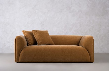
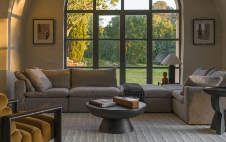
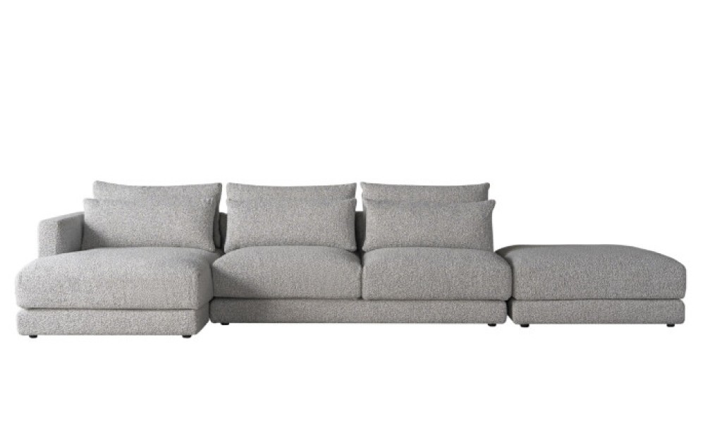
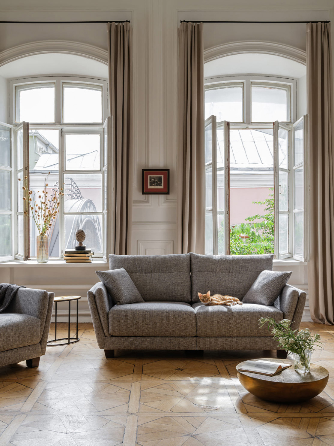
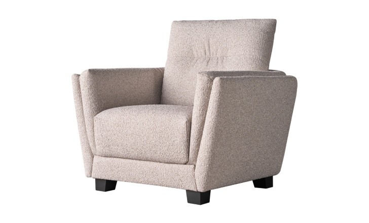
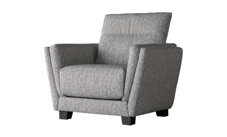
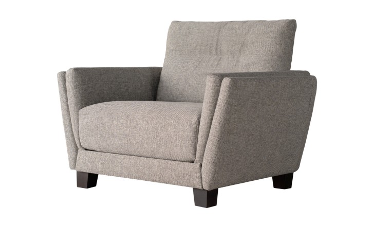
Giovanetti began Como while watching what happened to homes over two years of lockdown, when a living room had to be an office, a dining room and a cinema in the same afternoon. The answer was a sofa generous enough to be used in several ways and precise enough not to sag into any of them: proportions, seat depth and alignments were calculated rather than eyeballed, with particular attention to how the back is supported when someone sits properly rather than sprawls. For him luxury is not display but an object's ability to bring elegance to a room of any size – which is why Como works as a three-seater in a villa and as an armchair in a flat.
Laure Grezard

Trained in France and in England, with a background in graphic design and weaving before industrial and furniture design. Her work is built on three principles she states plainly: sustainability, functionality, quality. The graphic training shows – she thinks in pattern and repetition, and then makes the pattern structural rather than printed.
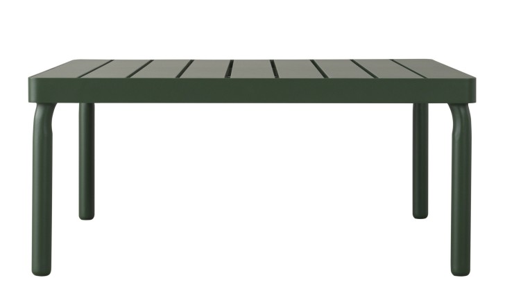
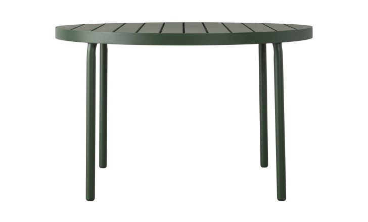
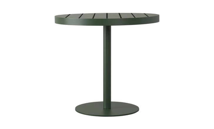
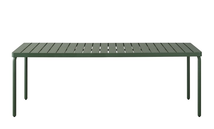
Taormina in Deep Green
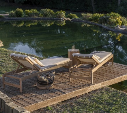
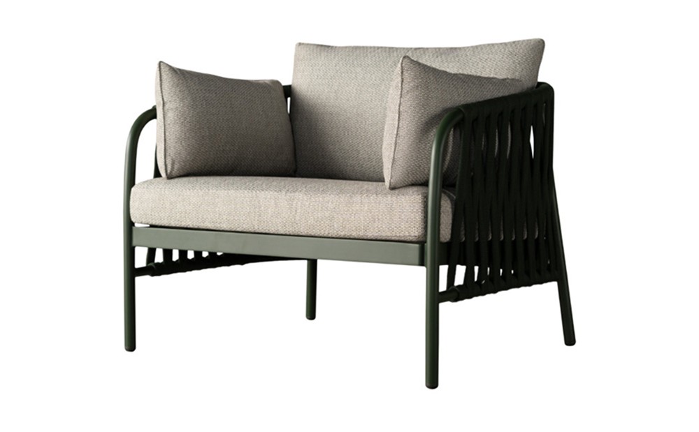
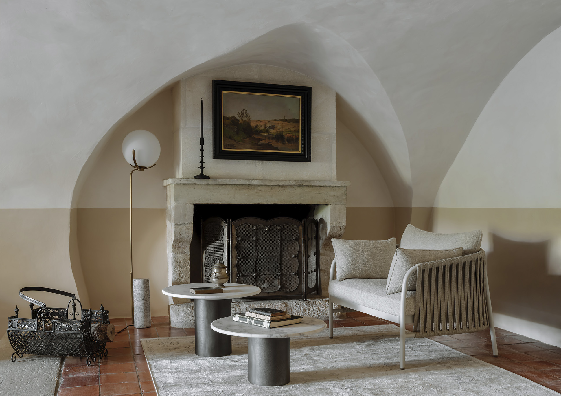
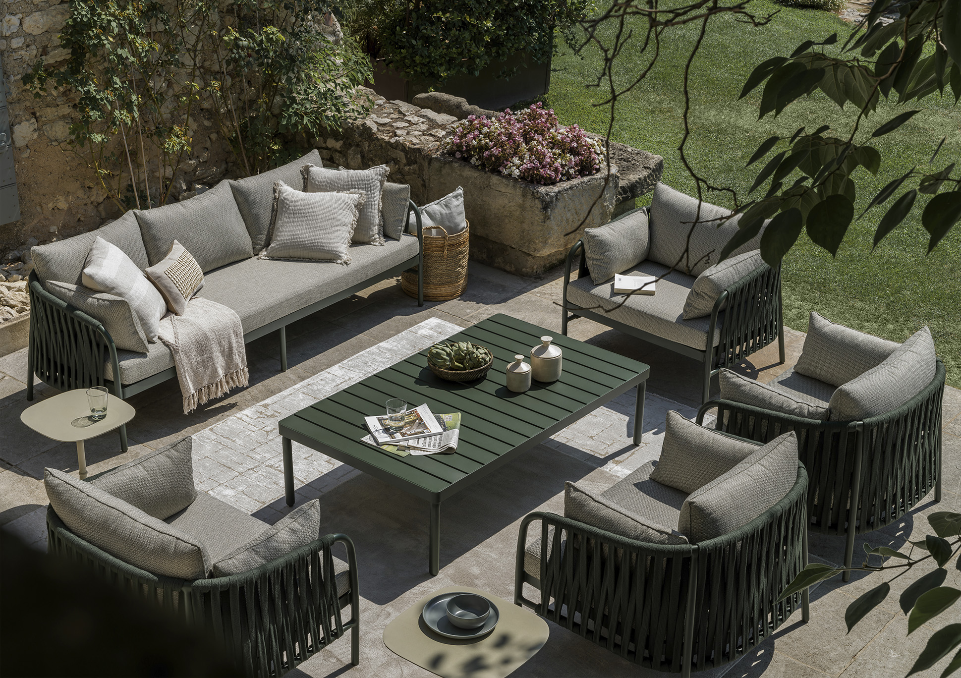
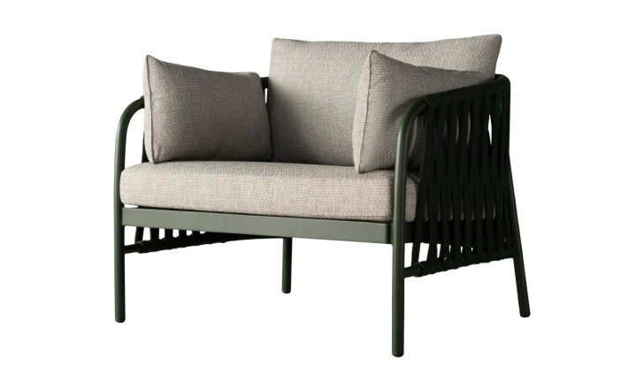
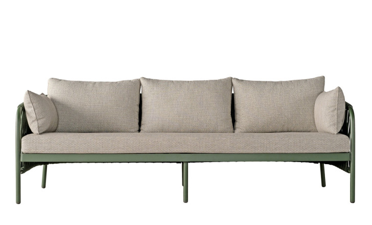
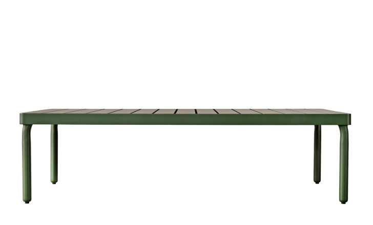
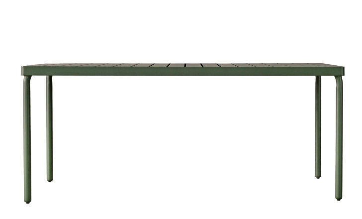
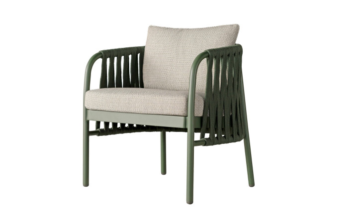
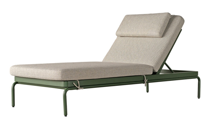
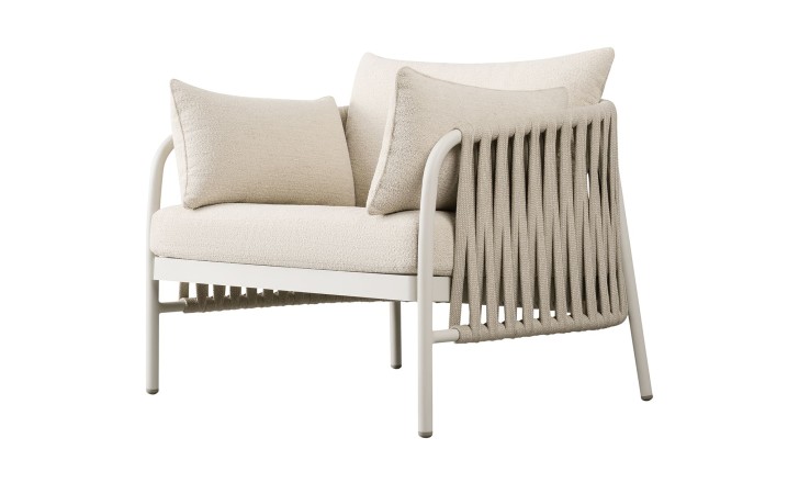
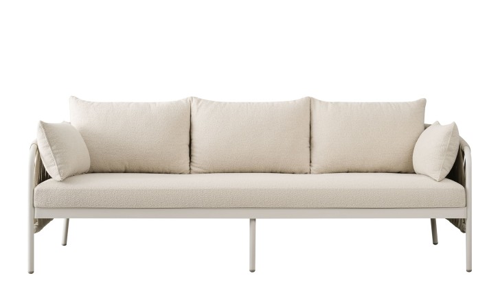
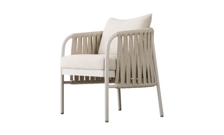
An outdoor collection designed by Grezard with art direction from Patterson, and the rope work is what gives it its character: a structured, rhythmic weave across the backs of the chairs and sofa, holding the body while letting air and light through, which matters far more outdoors than in. The frames are slim and architectural, wrapped rather than padded, so nothing holds water and nothing sags after a season. It launched in a deep, confident green, a colour that works with planting rather than against it: set among leaves and grass the furniture disappears into the garden and the garden looks fuller for it.
Taormina in Haze Sandy
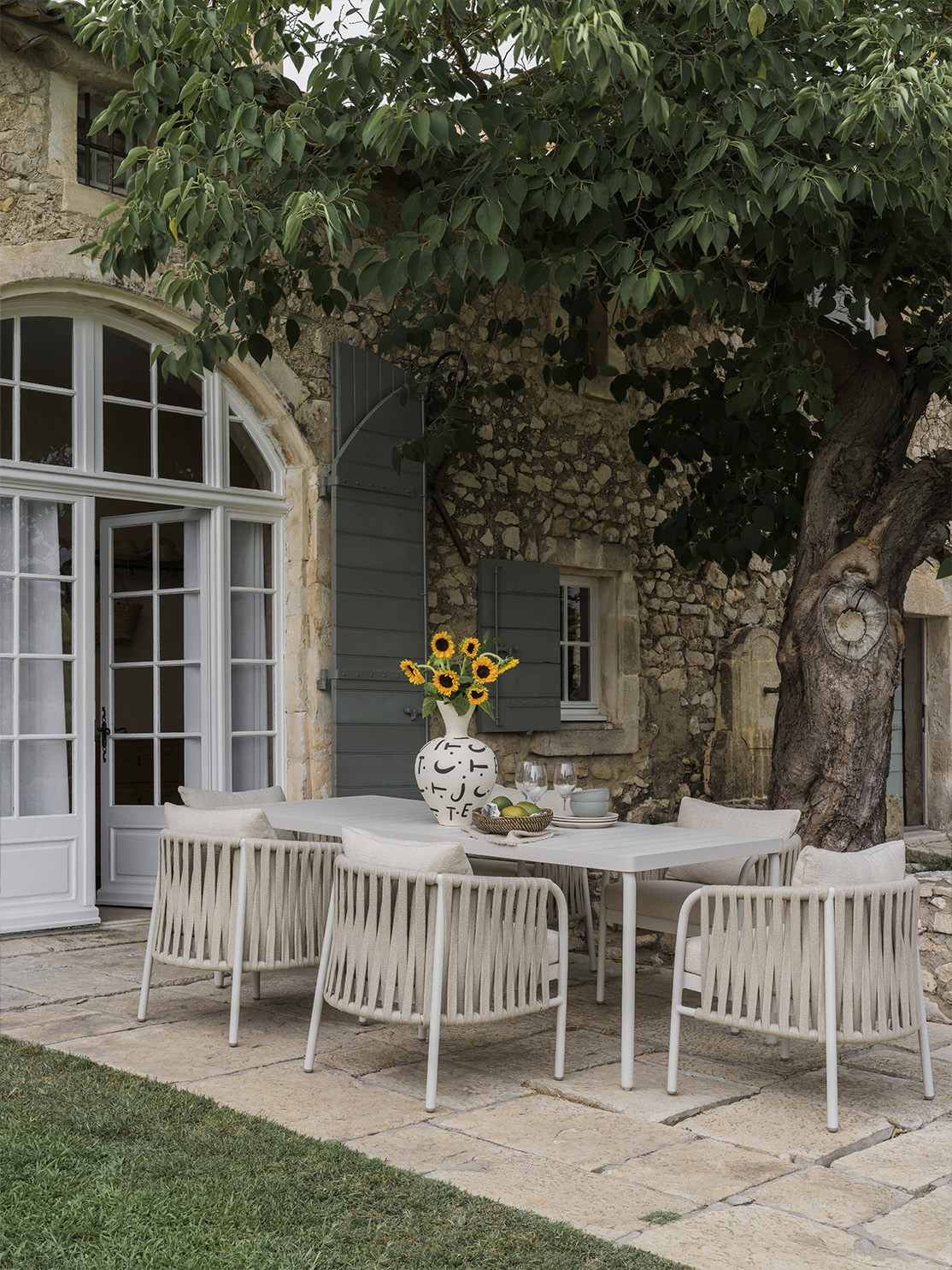
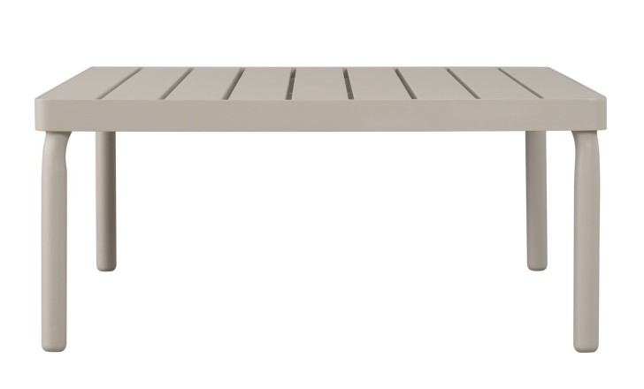
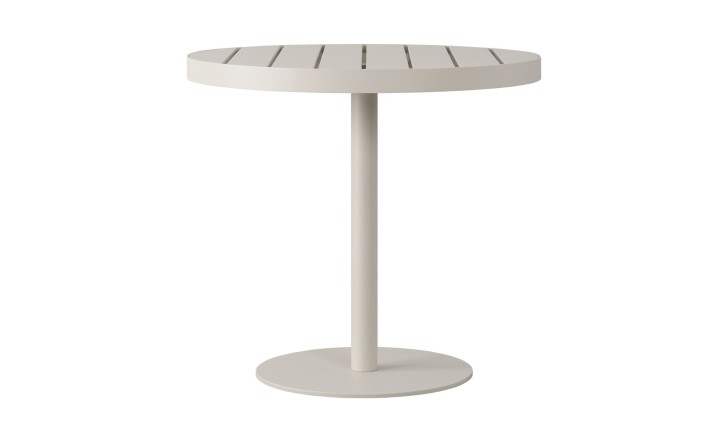
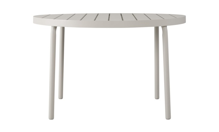
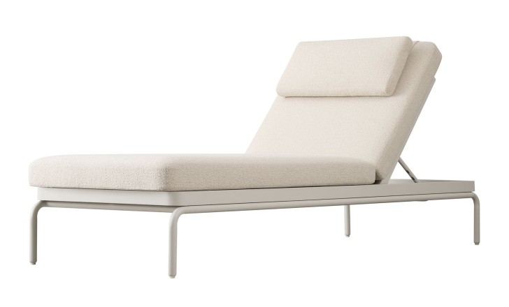
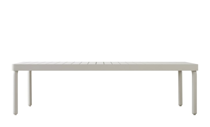
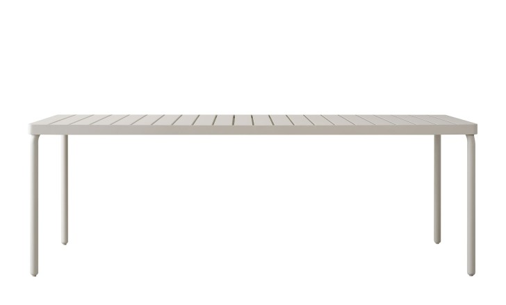
The same design in a sand tone, and a different temperament altogether. Where the green sets the furniture against the garden, Haze Sandy lets it settle into pale stone, bleached timber and sun-washed render, so a terrace reads as a continuation of the rooms behind it rather than a separate outdoor scheme. The rope detailing gains from the lighter ground: in green the weave is felt more than seen, in sand every line of it is legible, and the collection looks less like garden furniture and more like an interior that happens to be outside.
Twelve collections, four hands, one house: the pieces are designed to be mixed, and the Dantone Home designers can work out which of them belongs in your rooms, and in what order to buy them