
Colour Comes Back: Accent Pieces for a Neutral Room
For about ten years the safe answer to any room was greige, and it left a great many flats in Dubai looking like the same flat. That is shifting. Palettes are coming back warm and saturated: ochre, terracotta, rust, deep green, oxblood, teal.
An accent works on two conditions. There should be one of it, because two competing colours read as indecision. And it should answer something already in the room: the wood of a table, the tone of a rug, a shade in a picture. A colour with a relative in the room looks chosen. A colour with none looks dropped in. Start with something small enough to change your mind about, since a print, a vase, a cushion and a rug all carry colour at full strength, and none of them commits the room the way a sofa does.
Five categories of accent pieces gathered here, all of them on sale until 30 August as part of Dubai Summer Surprises, at up to 50% off
On the Wall
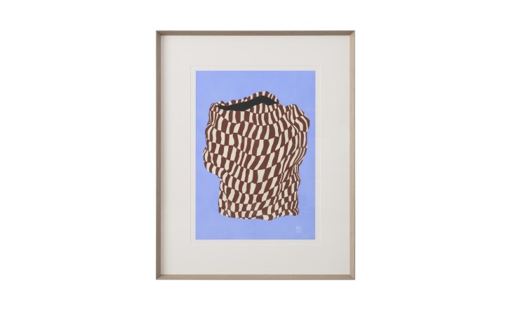
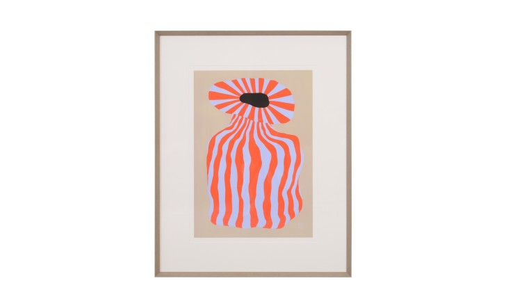
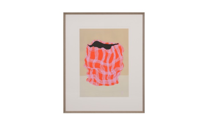
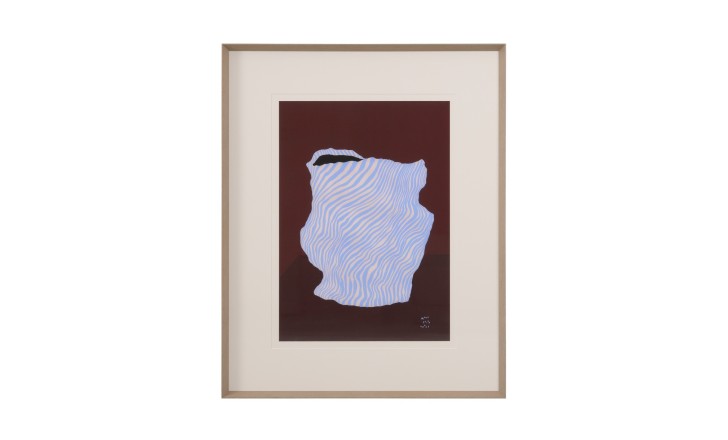
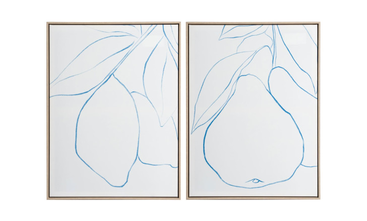
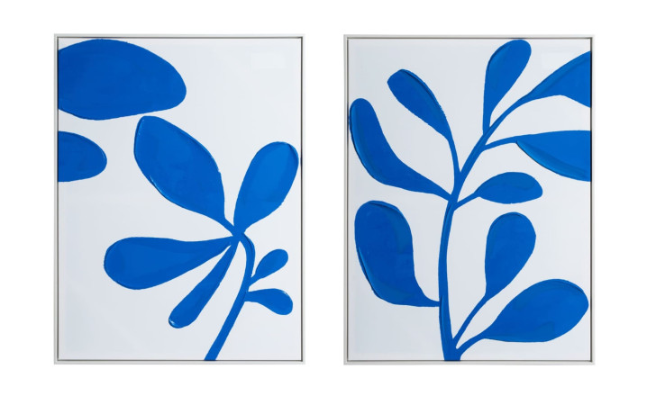
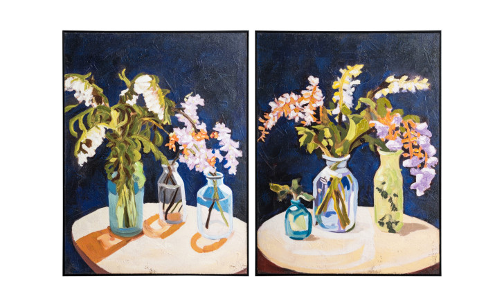
A wall is the cheapest square metre in the house and usually the emptiest. Framed prints put colour at eye level without taking a centimetre of floor, and they give everything else a colour to answer to: pick a cushion or a vase from a shade already in the frame and the room reads as composed.
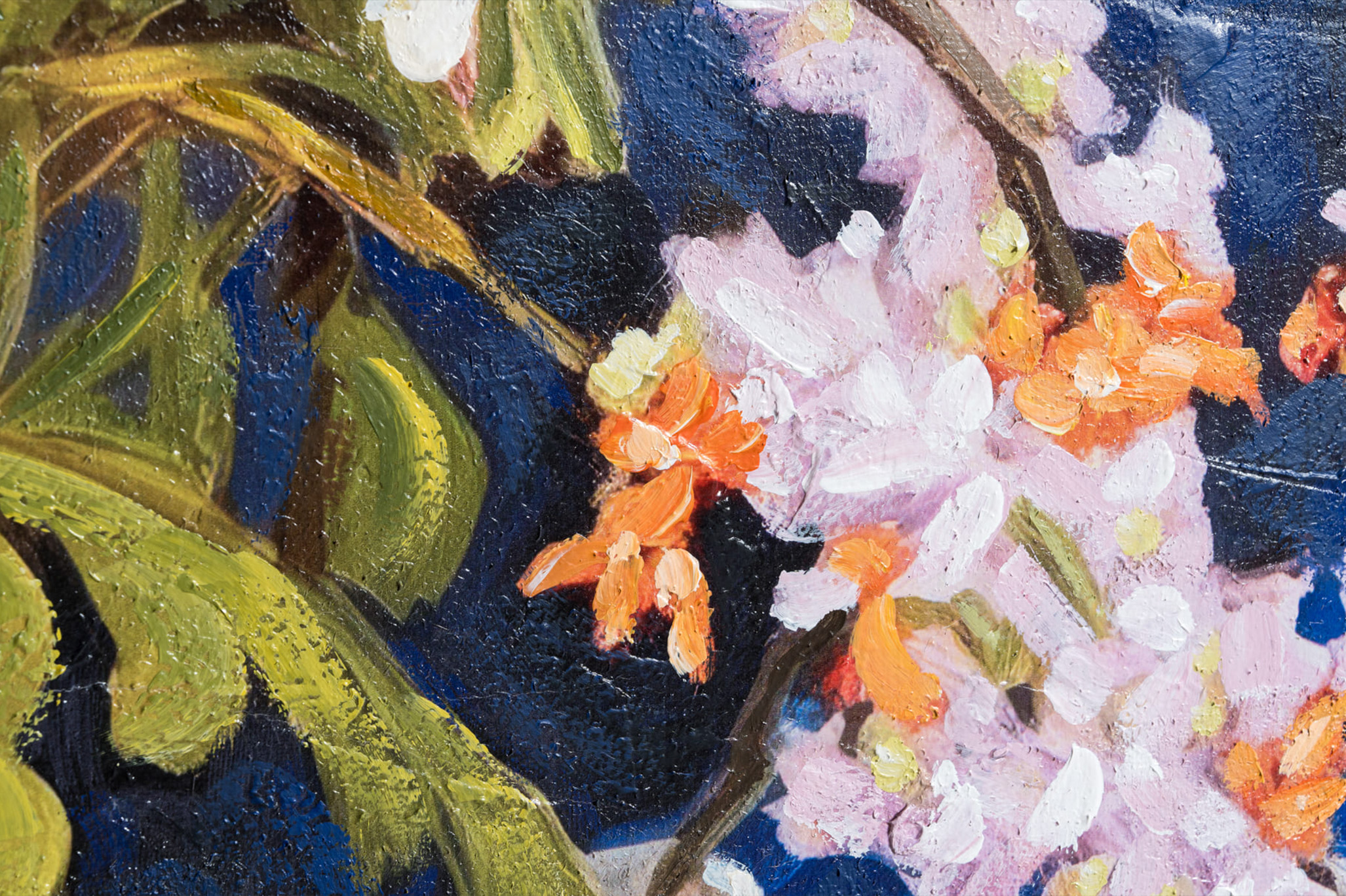
Graphic line drawings suit rooms with clean furniture. Botanical and fruit studies sit better in rooms with wood and pattern already in play. Sets of two work above a sofa or a console, where a single frame tends to float.
On the Shelf
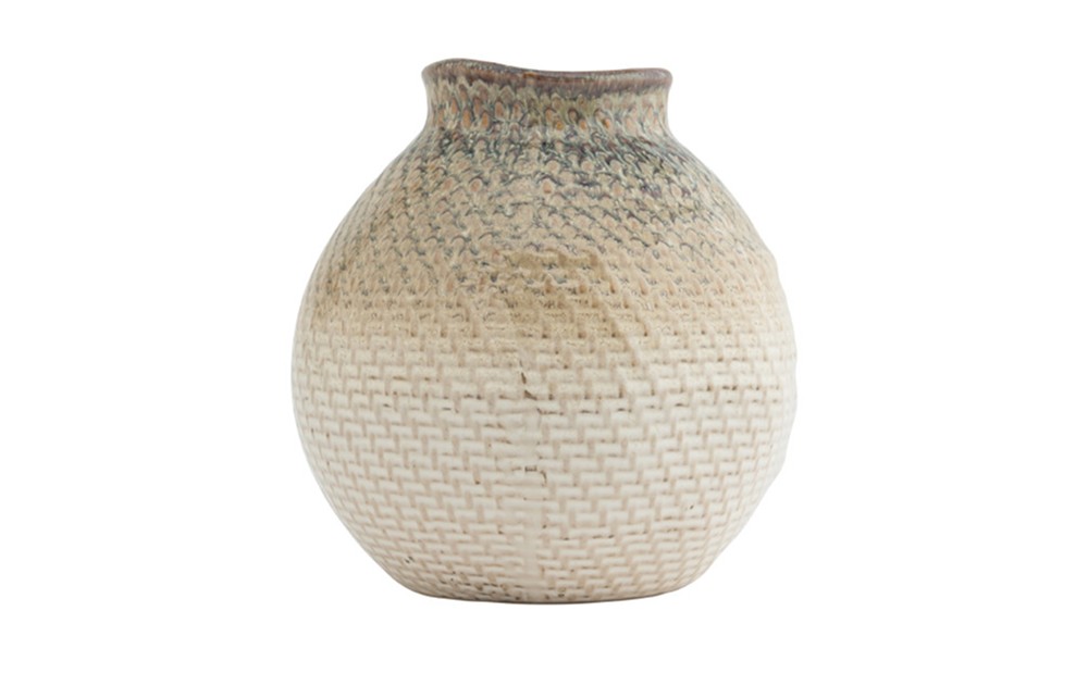
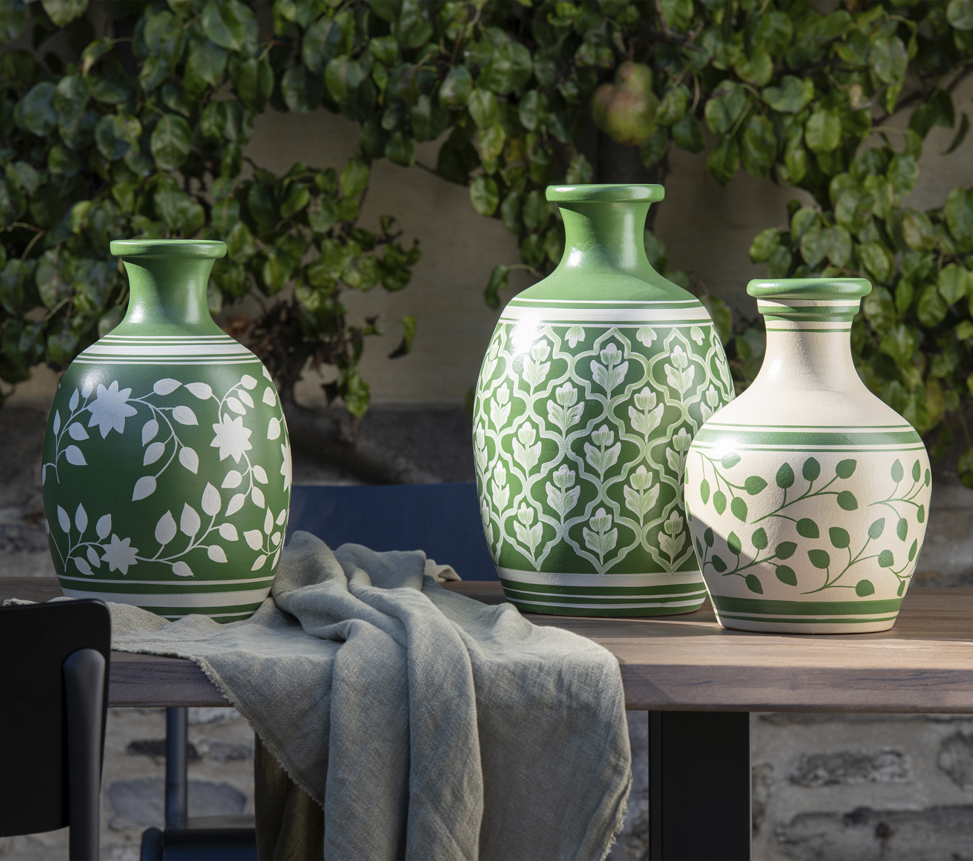
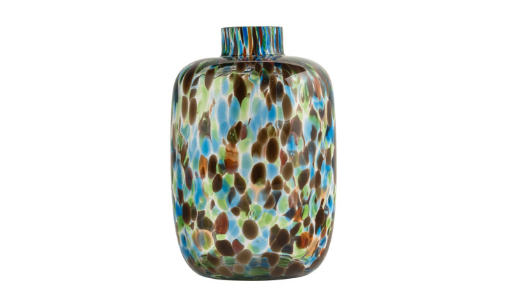
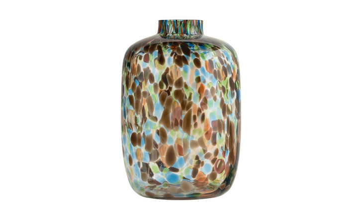
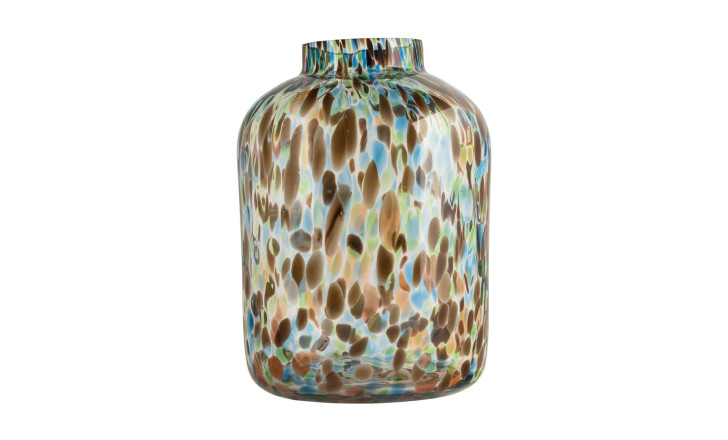
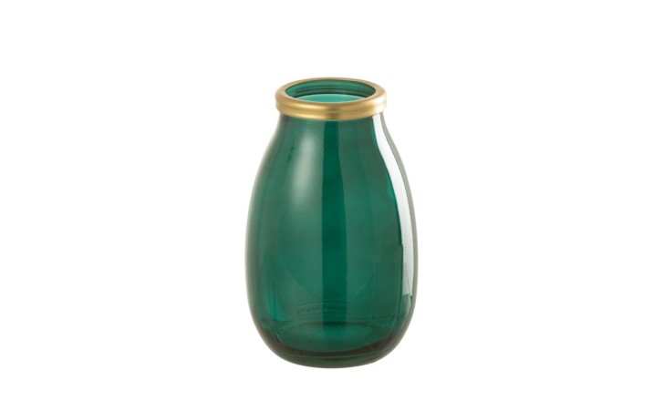
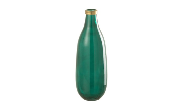
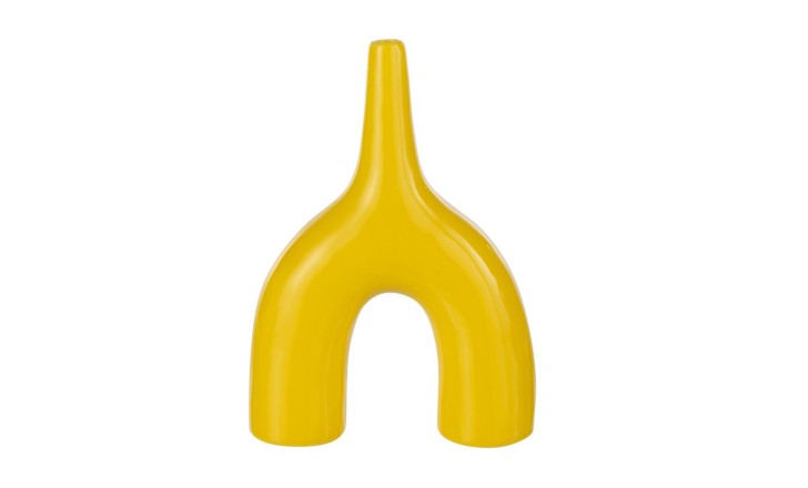
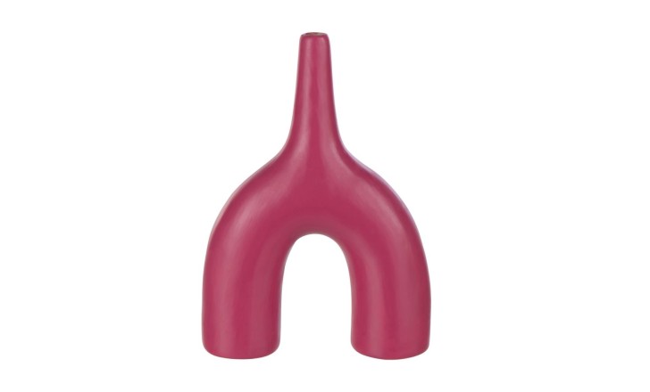
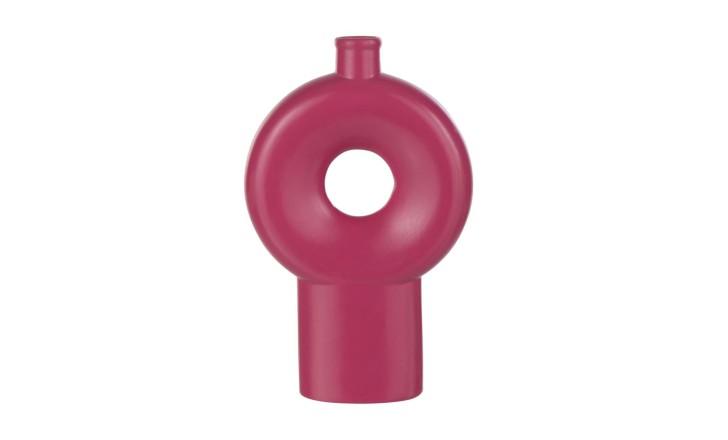
Vases and baskets are the easiest accents to live with, because they move. A fuchsia vase that dominates a console in the morning can move to the dining table by evening, or join a group of three, where a strong colour settles down.
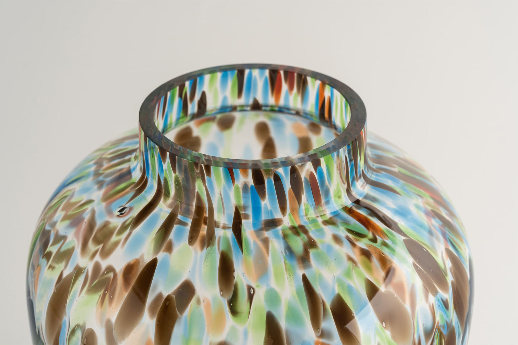
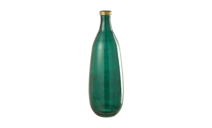
Glass and ceramic behave differently. Coloured glass changes through the day: an orange or green vase near a window holds light and throws it onto the surface underneath, so it reads brightest in the afternoon. Glazed ceramic stays constant and holds its colour in a dim corner. Woven baskets carry colour and texture at once, which suits a room that is quiet in tone but short on things to touch.


On the Sofa
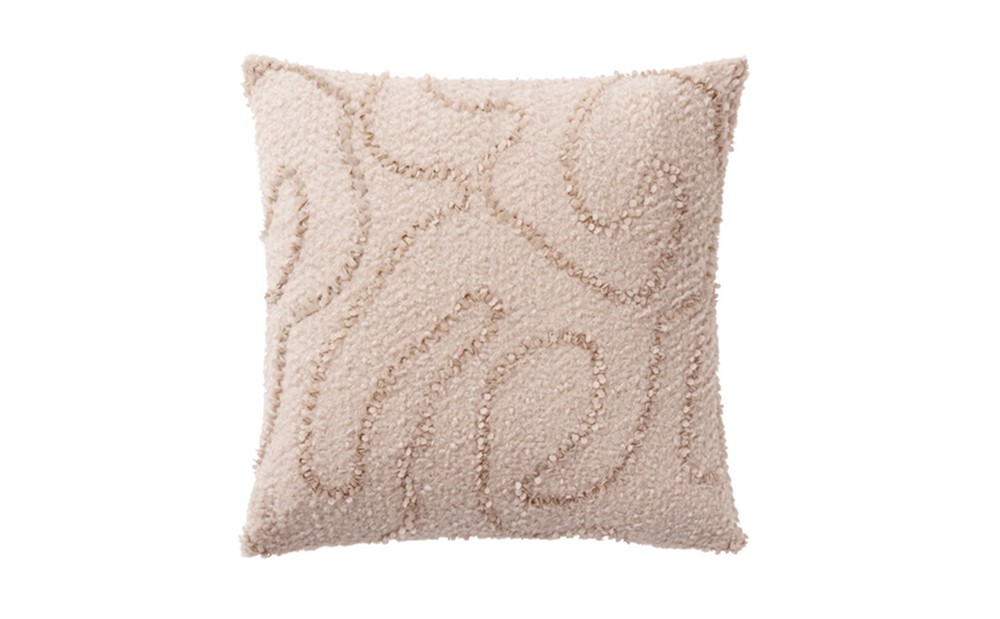
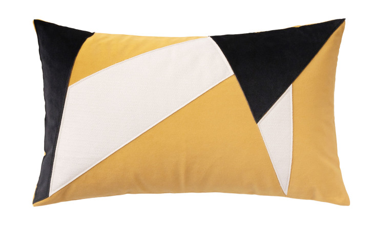
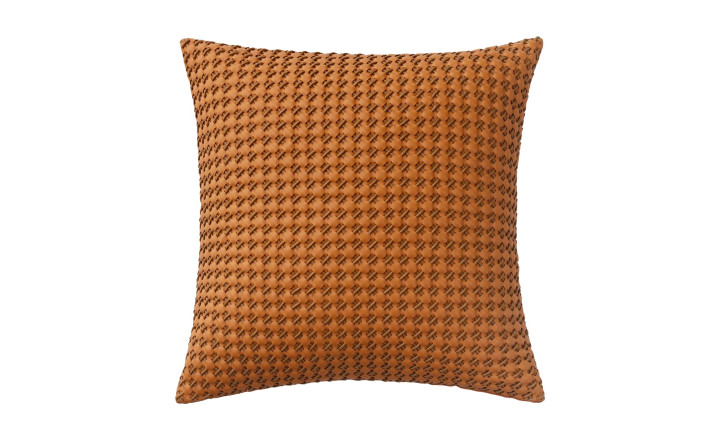
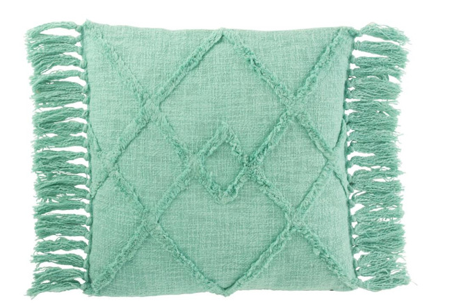
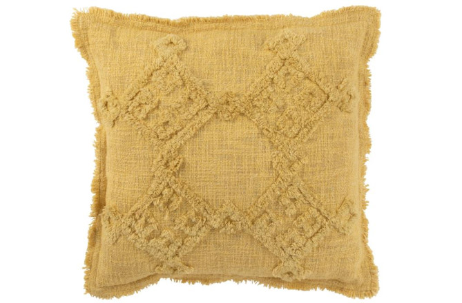
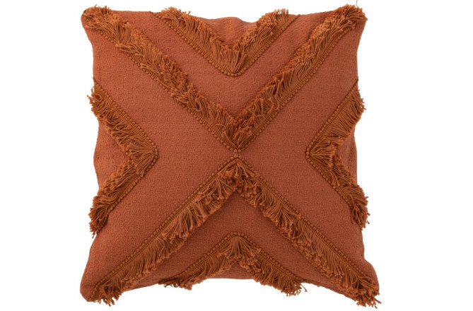
Cushions are the accent people reach for first, and the one most often overdone. Six cushions in six colours turn a sofa into a display. Two or three, in colours that talk to each other, do the work: mustard against terracotta, turquoise against a neutral weave.
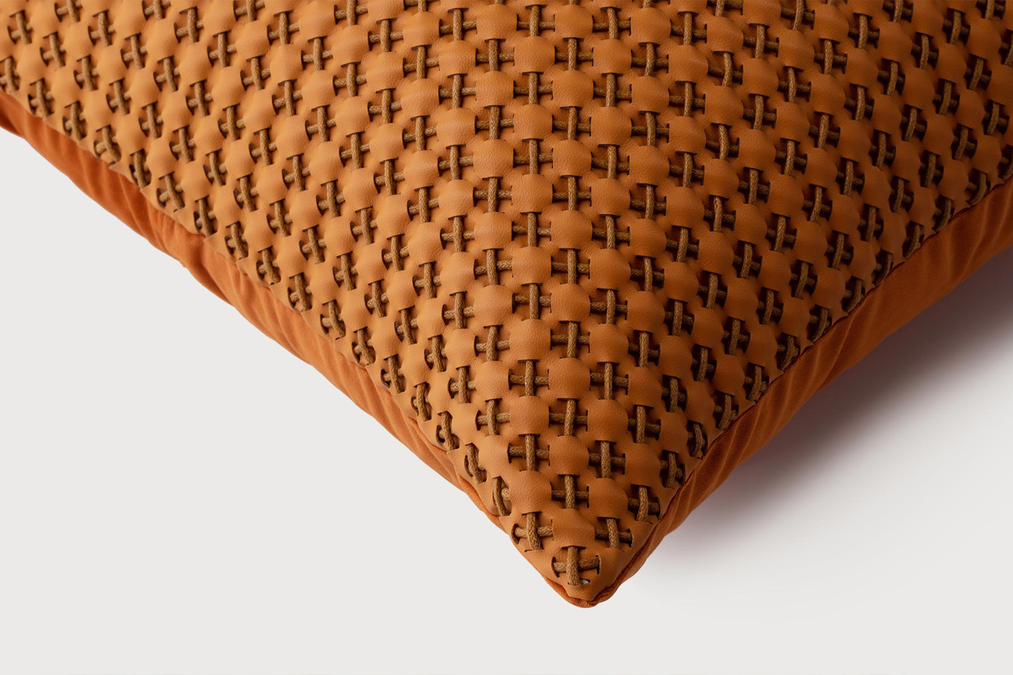
Texture matters as much as colour here, since a cushion is the one accent that gets picked up and moved. Fringing, a woven diamond, a flat cotton ground: three cushions in one colour family and three different surfaces hold a sofa together better than three flat cushions in three colours.
On the Table
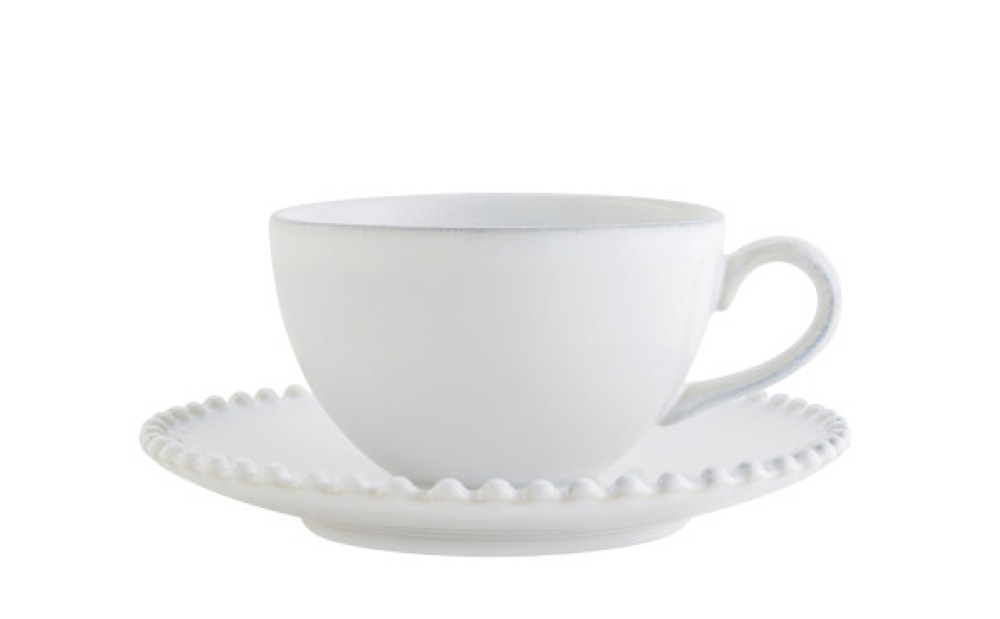
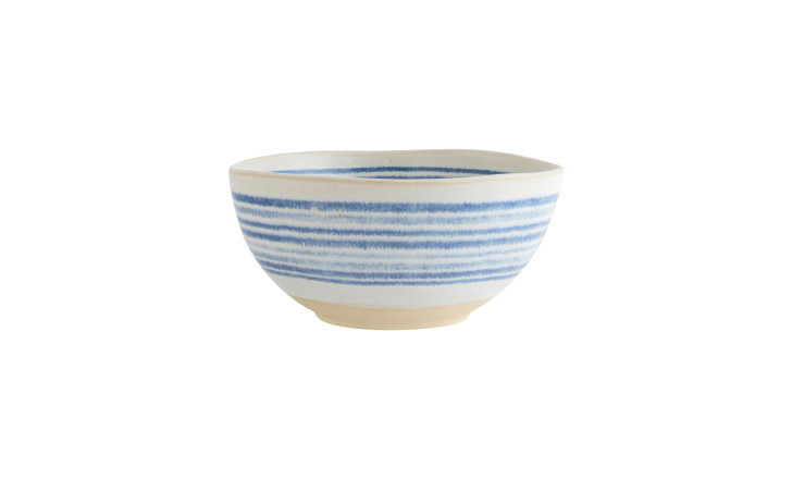
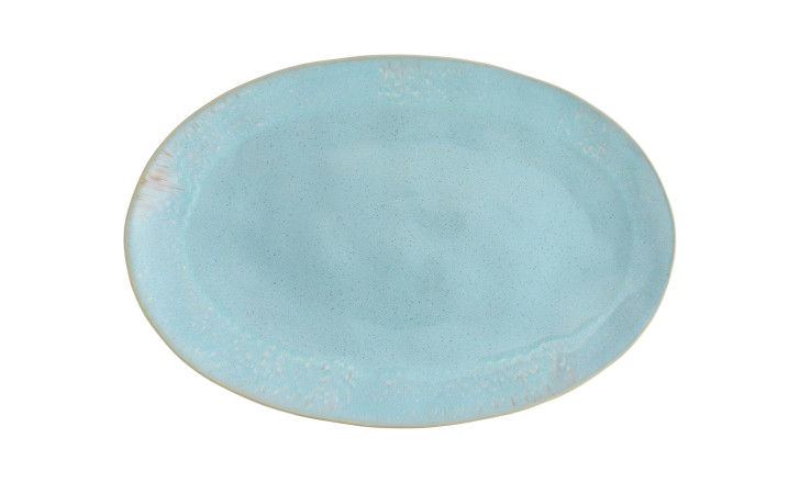
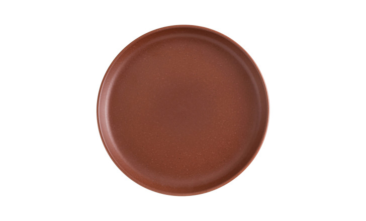
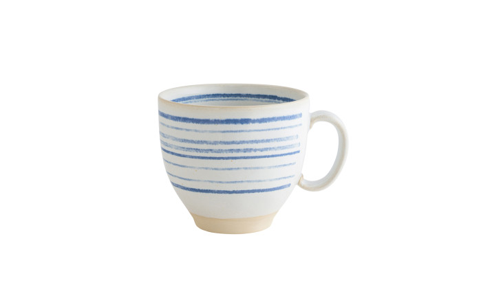
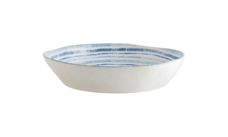
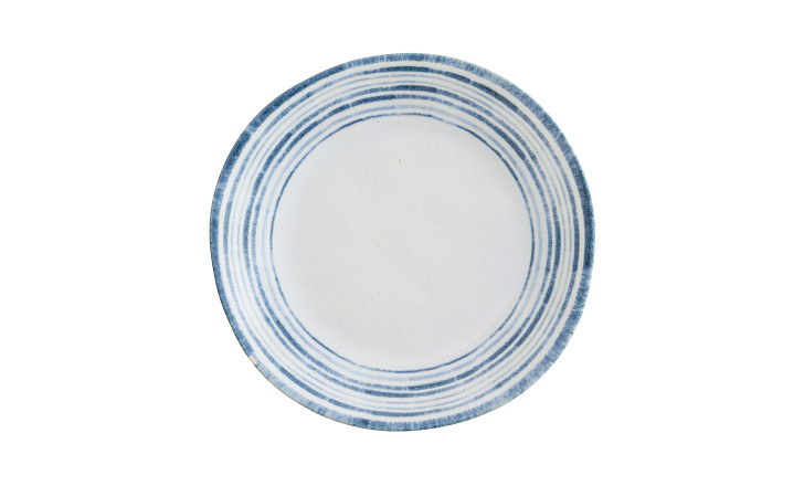
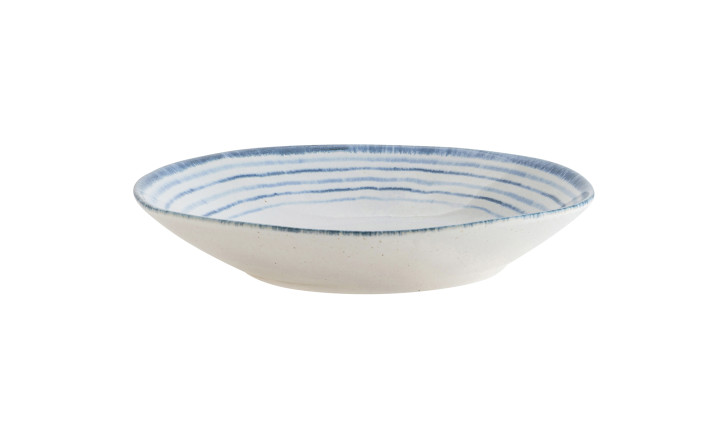
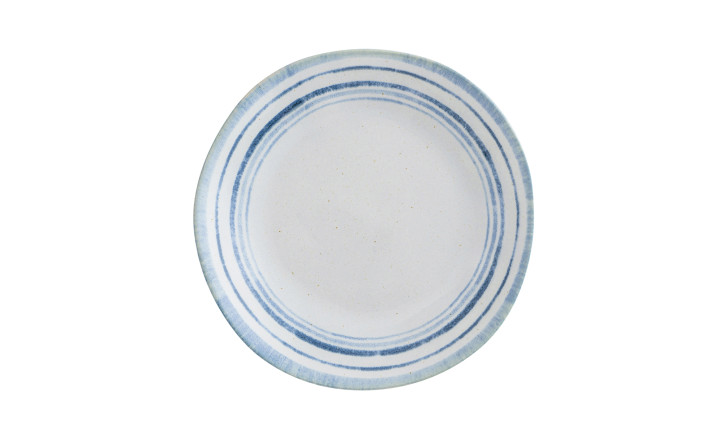
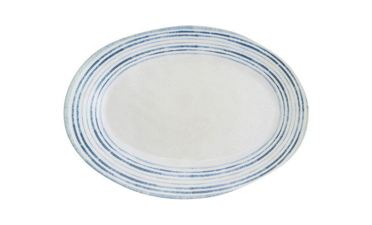
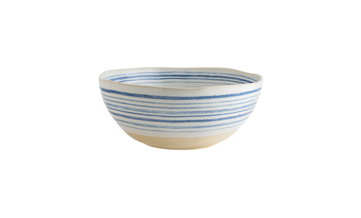
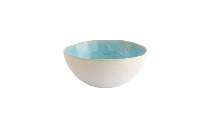
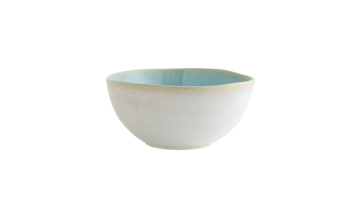
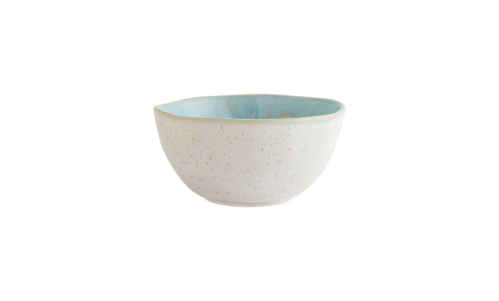
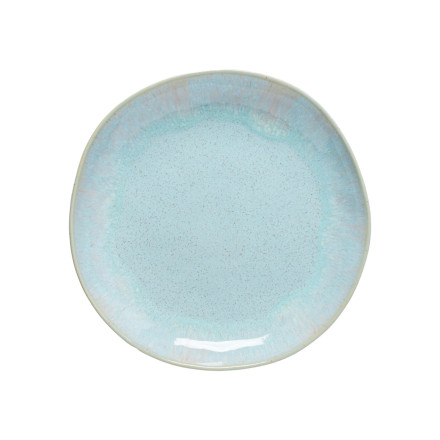
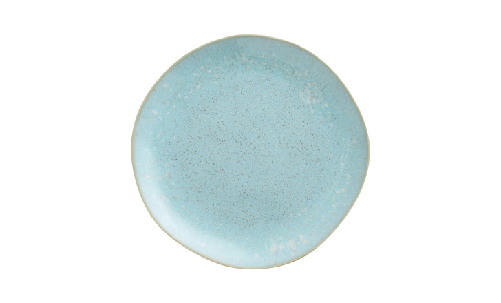
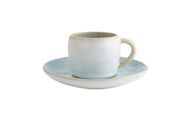
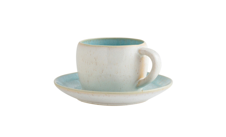
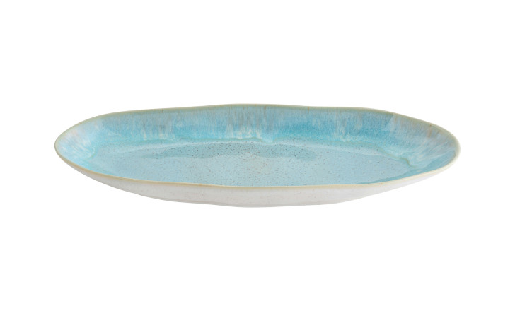
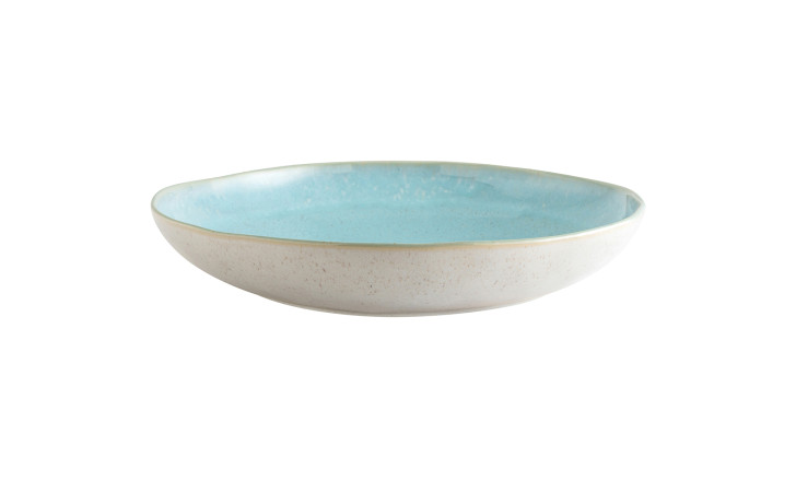
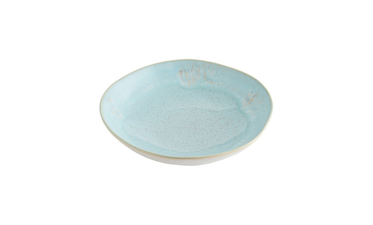
Tableware is the accent that only appears when there are people in the house, which makes it the least risky of all. A neutral dining room stays neutral on a Tuesday and turns blue or terracotta when the table is laid.
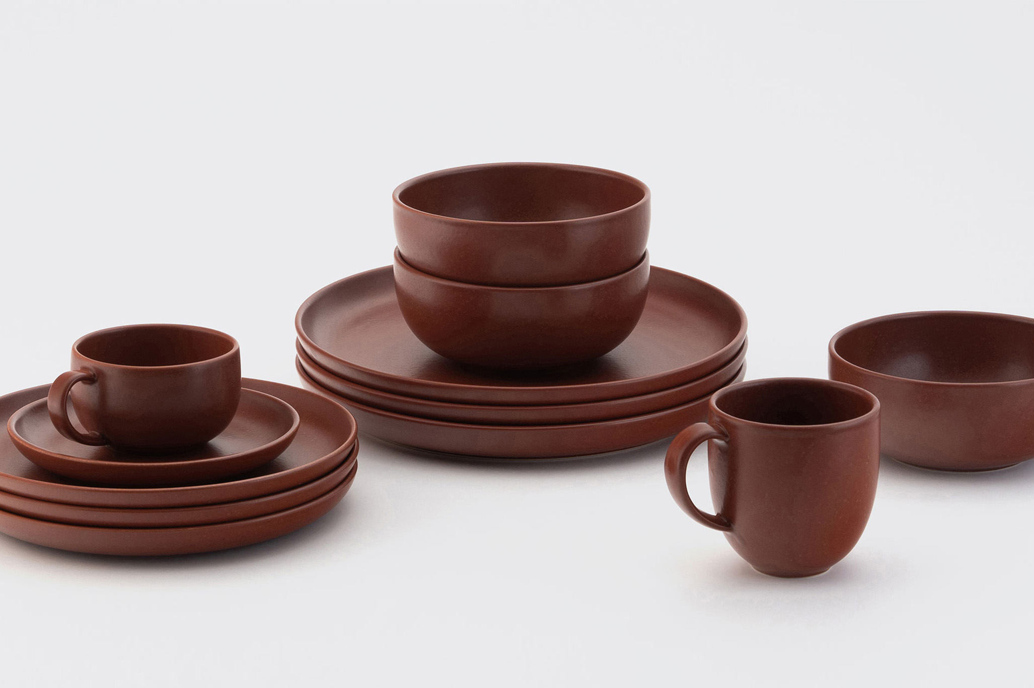
Working by series rather than by piece is what keeps it from looking assembled: a full set in sea blue, or in cayenne, gives the table one clear tone, and the room around it can stay exactly as it is.


Underfoot
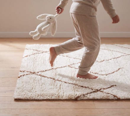
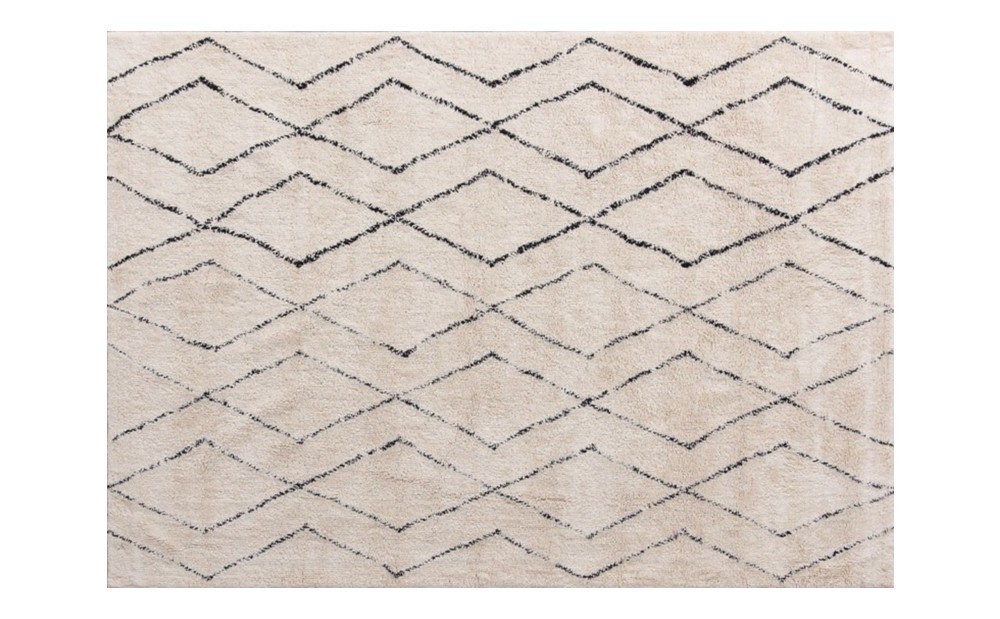
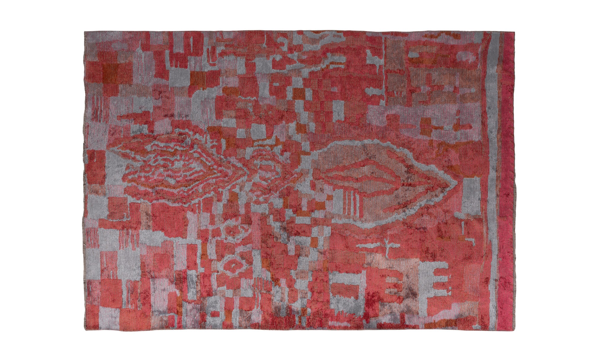
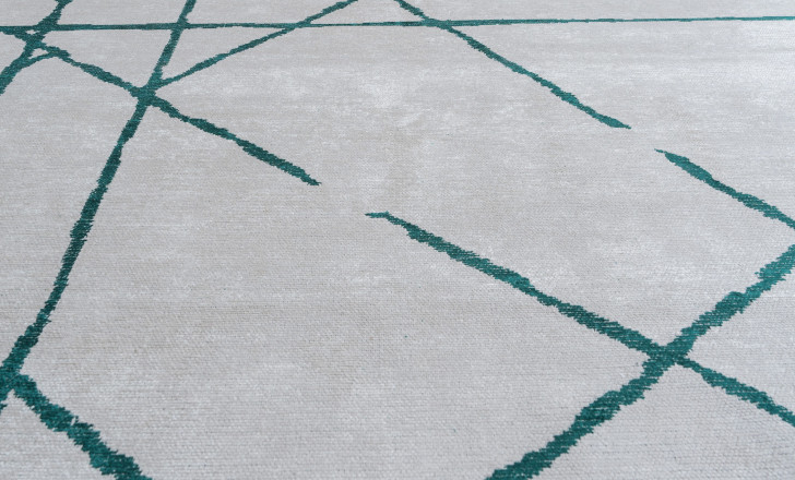
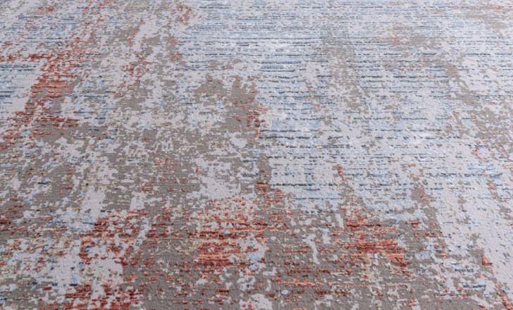
A rug is the biggest accent here, and the one that sets the tone for everything above it. Colour on the floor behaves differently from colour on a wall: it sits below eye level, and much of it disappears under the furniture, leaving the border and the space you walk on. A rug is therefore a safe place for a colour that would be too much higher up.
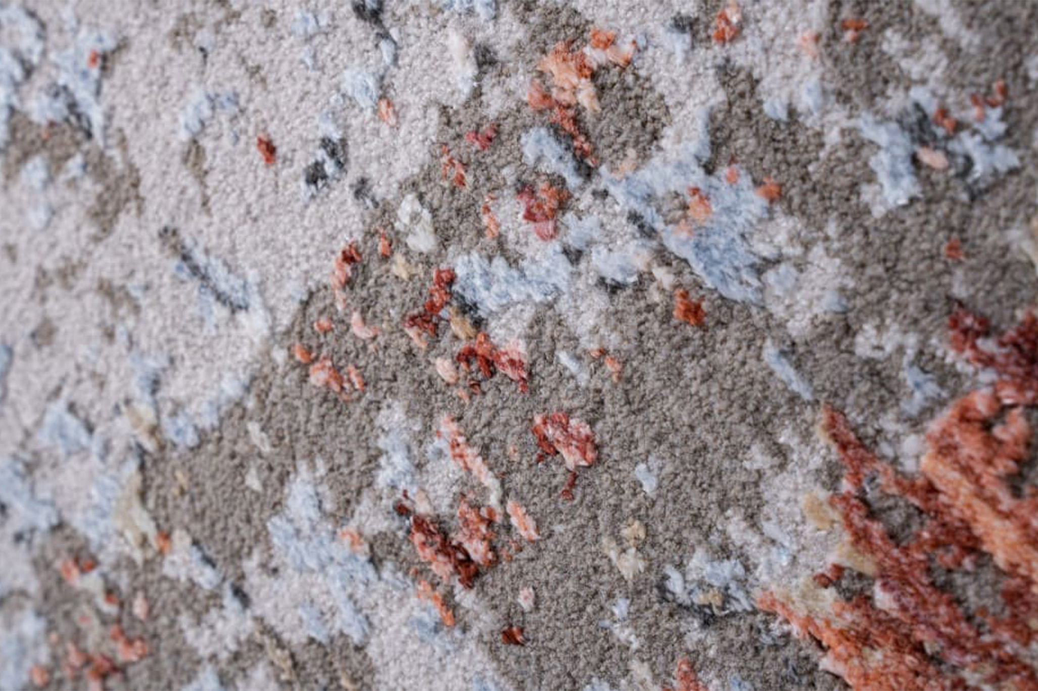
Green reads almost as a neutral in a room with wood. A rose or faded tone warms a grey room without anyone having to repaint it.
Where to Start
If the room is entirely neutral, start on the wall and work down: the print sets the colour, and everything after it has something to answer to. If the room already has a strong rug or a painting, start with cushions and vases in a tone already present, and let the existing piece stay the loudest thing in the room.
Dantone Home designers can help you place a colour so it belongs